In February of this year, I began working on a document that summarizes everything I think I know about investing in a written philosophy. This is partly an exercise for my main job, and partly a personal project. 2025 marks the 10th year since I bought my first book on investing. So I think this is a good milestone for such a document.
As you can see from todays’ date, some time has passed since February. Part of this is the usual need to sometimes prioritize other things in life. But part of it is also the recurring realization that writing down what you think you know is not so simple if you actually try to do it.
Since I have no deadline other than myself, I decided to fully go through this process.1“Self-imposed deadline” is somewhat of a contraction in itself, isn’t it? I gathered more data, questioned the arguments, added material which I thought is unnecessary, deleted material which I thought is necessary, and so on.
A few days ago, I finished the data-part of the project and the first major draft of the document should also be ready soon. To get things going and to create a public reference for some charts, I will publish them upfront in this post.
Think of this as a chartbook for (hopefully) interesting long-run data on major asset classes and simple multi-asset portfolios. Except for a few explanatory notes, I will leave the charts largely without comments. I leave that to the actual document and I am sure that readers will find their own interpretations anyway.
One final word to manage expectations. You will not find overly complicated research or methodology. In fact, all of it is (in my view) quite simple. That is by design. One goal I have with this project is to do it without jargon, complicated math, or other prerequisites. Any person who is willing to spend some time and brainpower should walk away with an overall understanding of investing.
- What Can We Invest In?
- Passive Investing: Liquid Asset Classes
- Active Investing: Some Examples
- Diversification: Good and Different
- Diversification in Action: Portfolios
- Conclusion and Next Steps
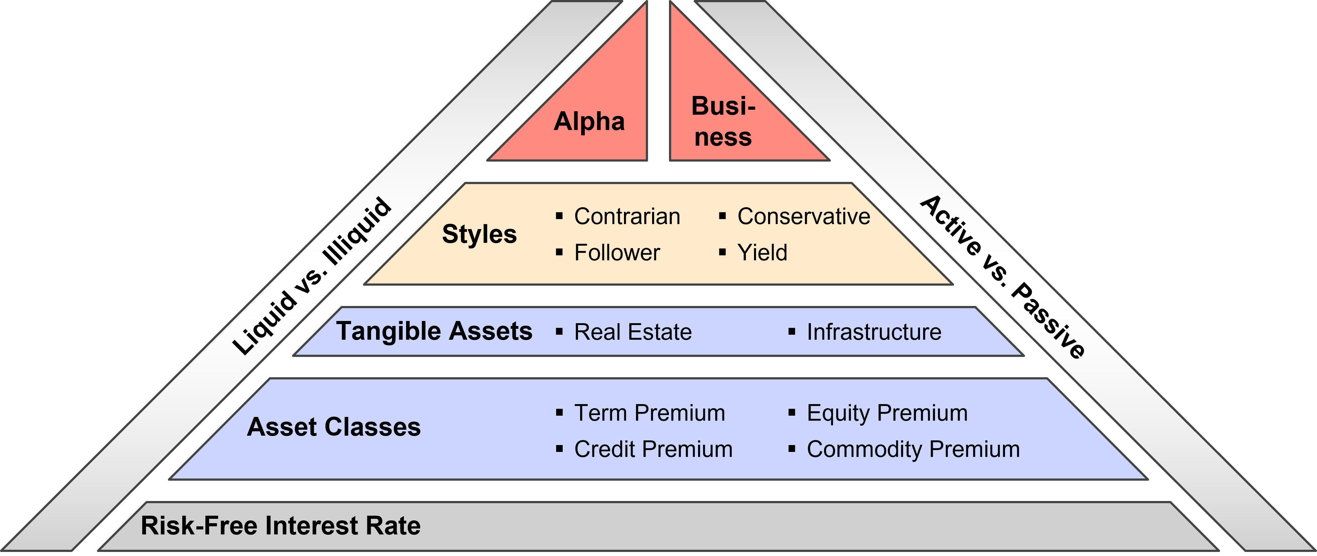
What Can We Invest In?
The pyramid below is an attempt to summarize my (current) top-down view on the investing world. It certainly does not cover everything, but I consider it a practical framework that covers most feasible options. The pyramid builds on a few core-convictions for which, in my opinion, there is compelling evidence and logic.
- The foundation and common element of all investments is the risk-free interest rate.
- There are only four major asset classes in the sense of return sources.
- Real estate and infrastructure are additional underlying assets with unique properties. Like everything else, we can invest in them via equity and debt claims.
- Many active strategies are explainable by exposures to asset classes and four major styles.
- Beyond asset classes and styles, there are two remaining levers to add value.
- “True” Alpha in the sense of attractive returns that cannot be explained by exposures to asset classes or styles.
- “Business” Alpha in the sense of entrepreneurship that generates such high returns that exposures to asset classes and styles are secondary.
- Liquidity characteristics do not create separate asset classes. Equity and debt remains equity and debt, no matter if it is traded daily or every 10 years.2However, it is true that certain underlying assets only trade in private markets, and some only trade in public markets.
Passive Investing: Liquid Asset Classes
The goal of this and the following sections is to provide long-term historical context on liquid asset classes. Each chart comes with a description that summarizes details about the data and methodology. Beyond that, the following general principles apply to all analyses.
Quality: All data are from what I believe are trustworthy sources in academia and practice. Many of the sources are associated with peer-reviewed academic research or real-world investment products. Except for the historical bond data, the sources are free and publicly available without a subscription. So it should be possible to replicate what I do here.
Coverage: Whenever sensible I use the broadest possible representation of the asset class. In practice, however, most of the data only covers the United States (US). It is still quite difficult to get global data for longer-term samples.
Reality: Wherever available I use real-world returns from index funds that include costs and would have been actually investable.
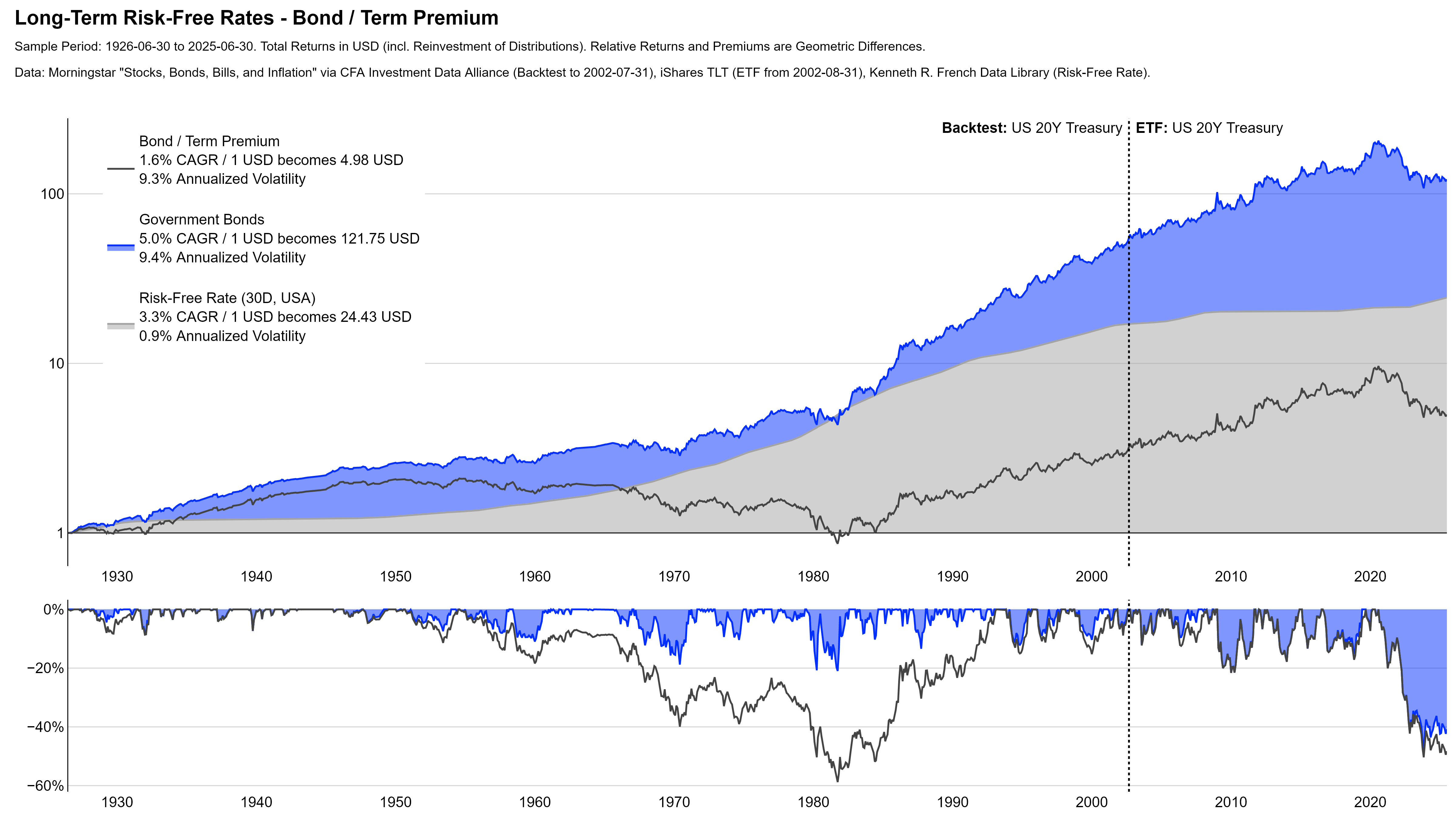
I balance those principles against data availability and misleading inconsistencies to create the (in my view) best-possible result. For example, I use 20 year US-Treasuries to illustrate government bonds. They obviously just cover the US and are one of the most extreme implementations of the asset class. But I could get data back to 1926 from a high-quality source. Overall, I believe the chart is better with those limitations than with an inconsistent mix of different maturities.
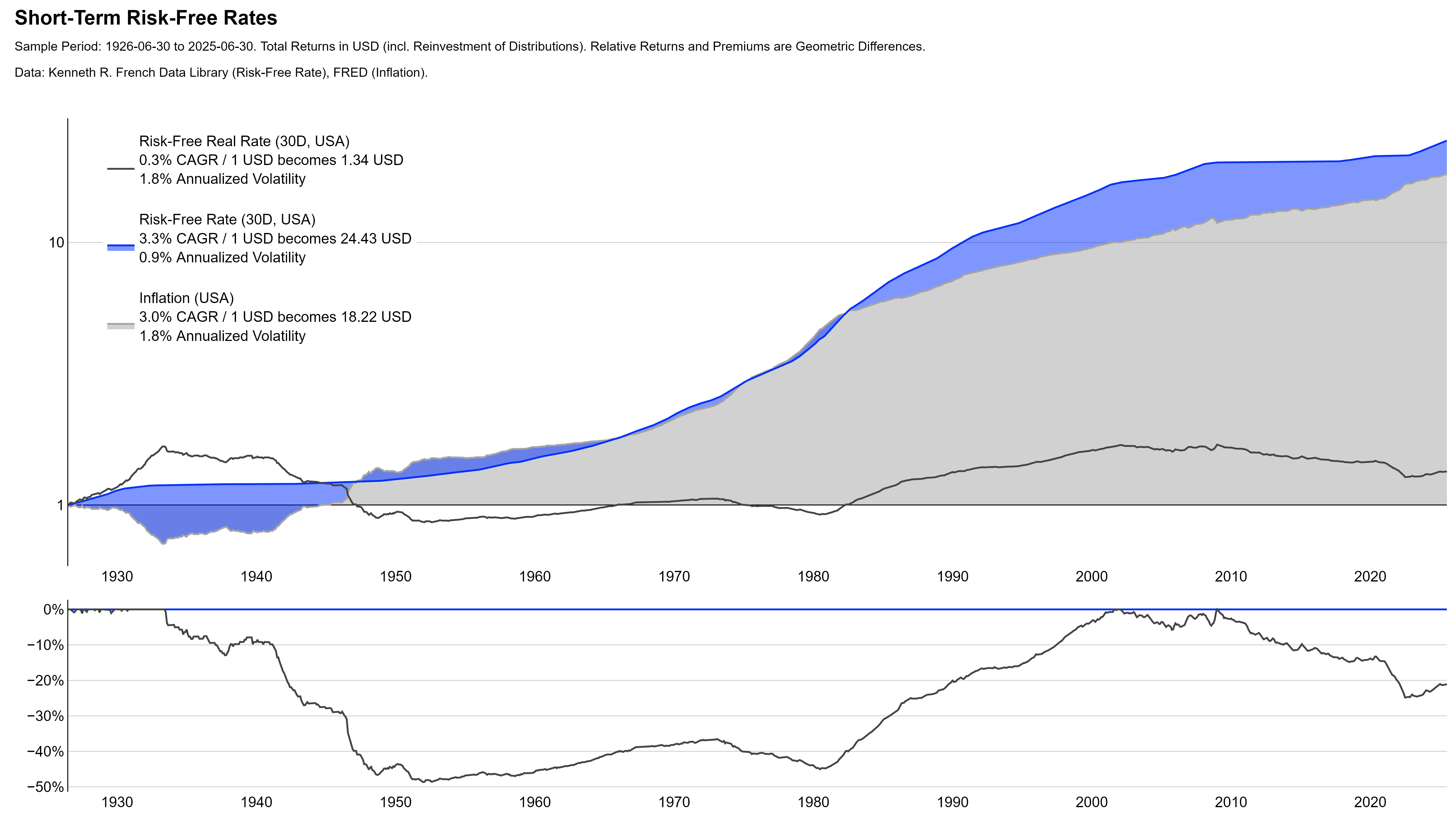
Short-Term Risk-Free Rates
Long-Term Rates: Government Bonds
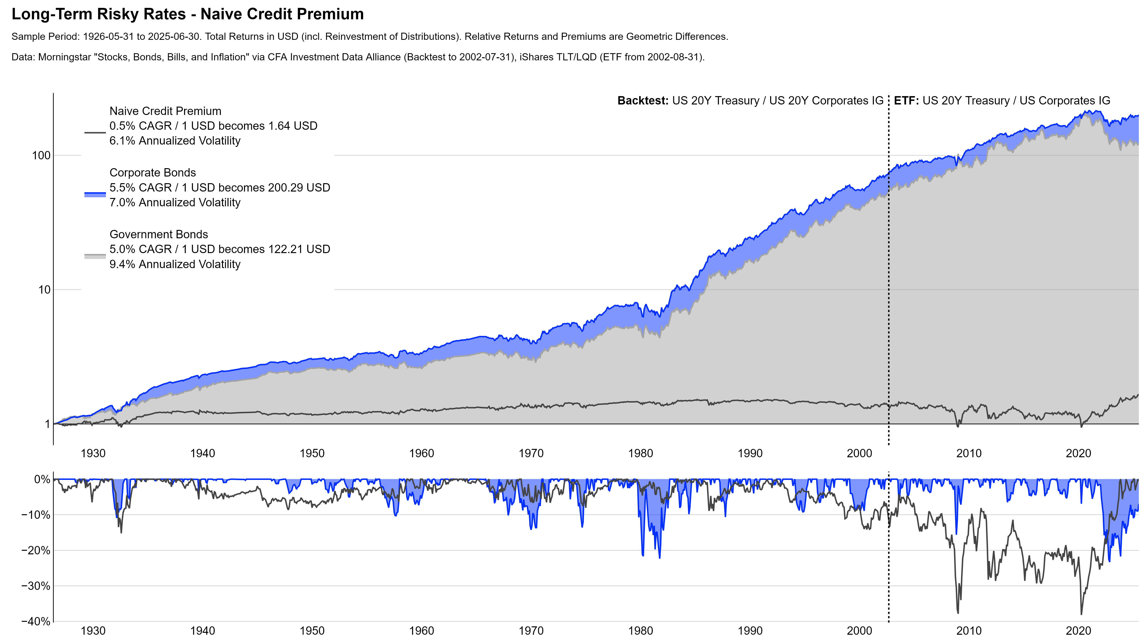
Risky Rates: Corporate Bonds
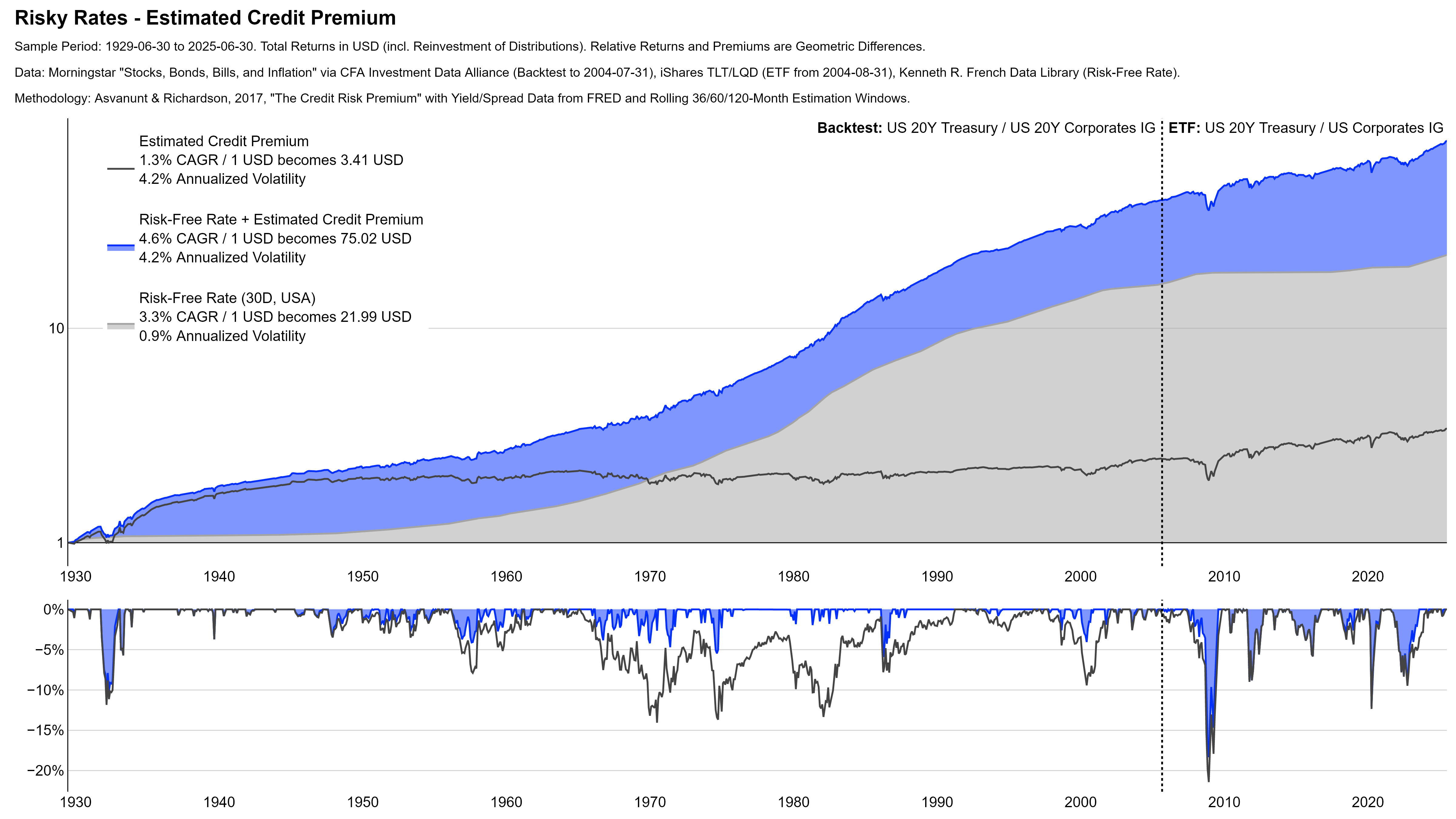
Long-term corporate bonds typically capture both, duration and credit risk. To isolate the credit risk premium, the time series in the chart below adjust for that. Think of the Estimated Credit Premium as a portfolio that buys corporate bonds and sells government bonds to hedge the overall duration exposure to roughly zero.
Today, it is much easier to invest directly into the credit premium. For example, via floating or high-yield bonds. But there is no such long-term history for those instruments.
Overall, I would consider the data below as a rather conservative estimate for the credit premium. With today’s investment opportunities you can play the asset class much more aggressively.
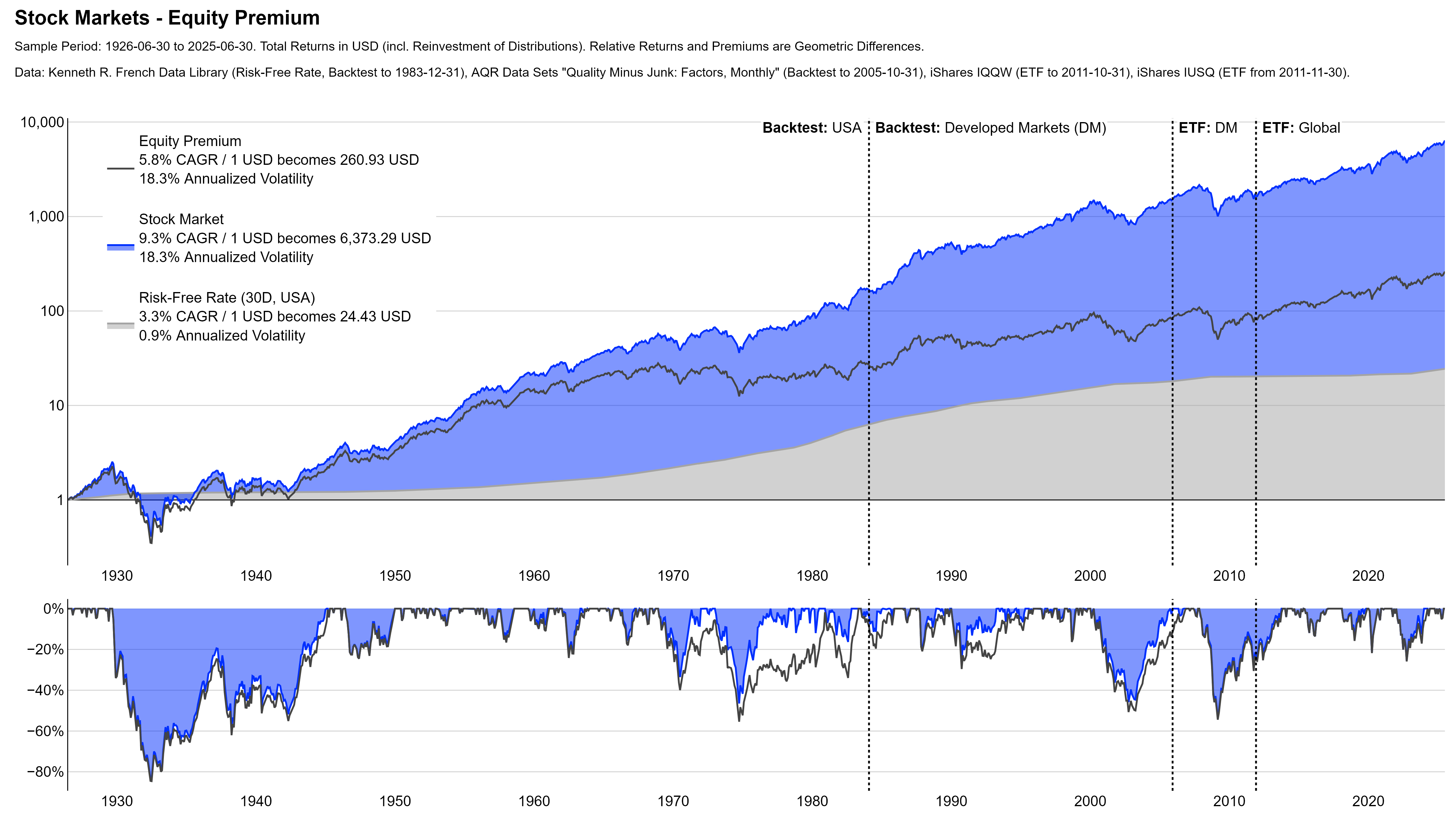
Stock Markets
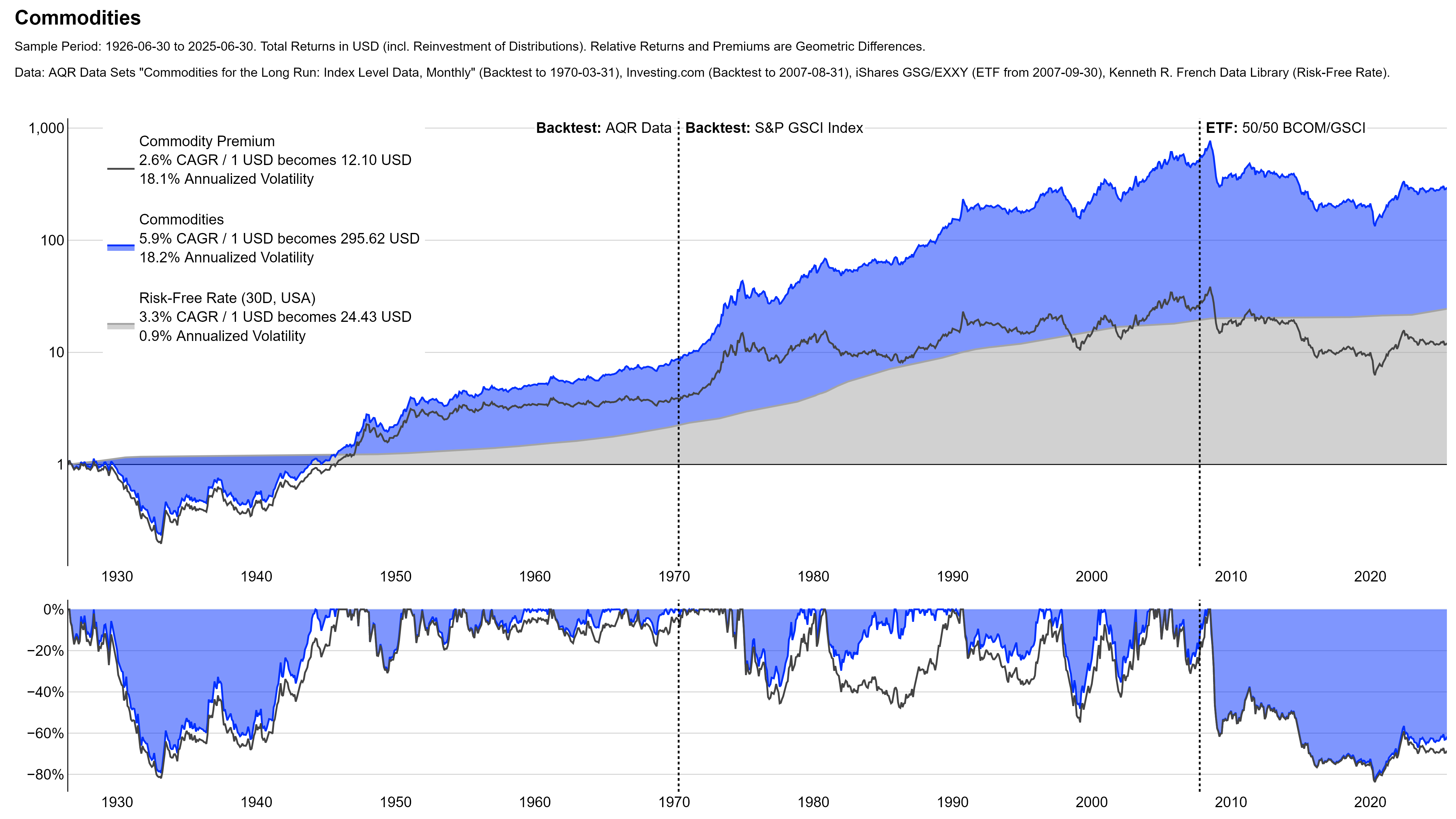
Commodities
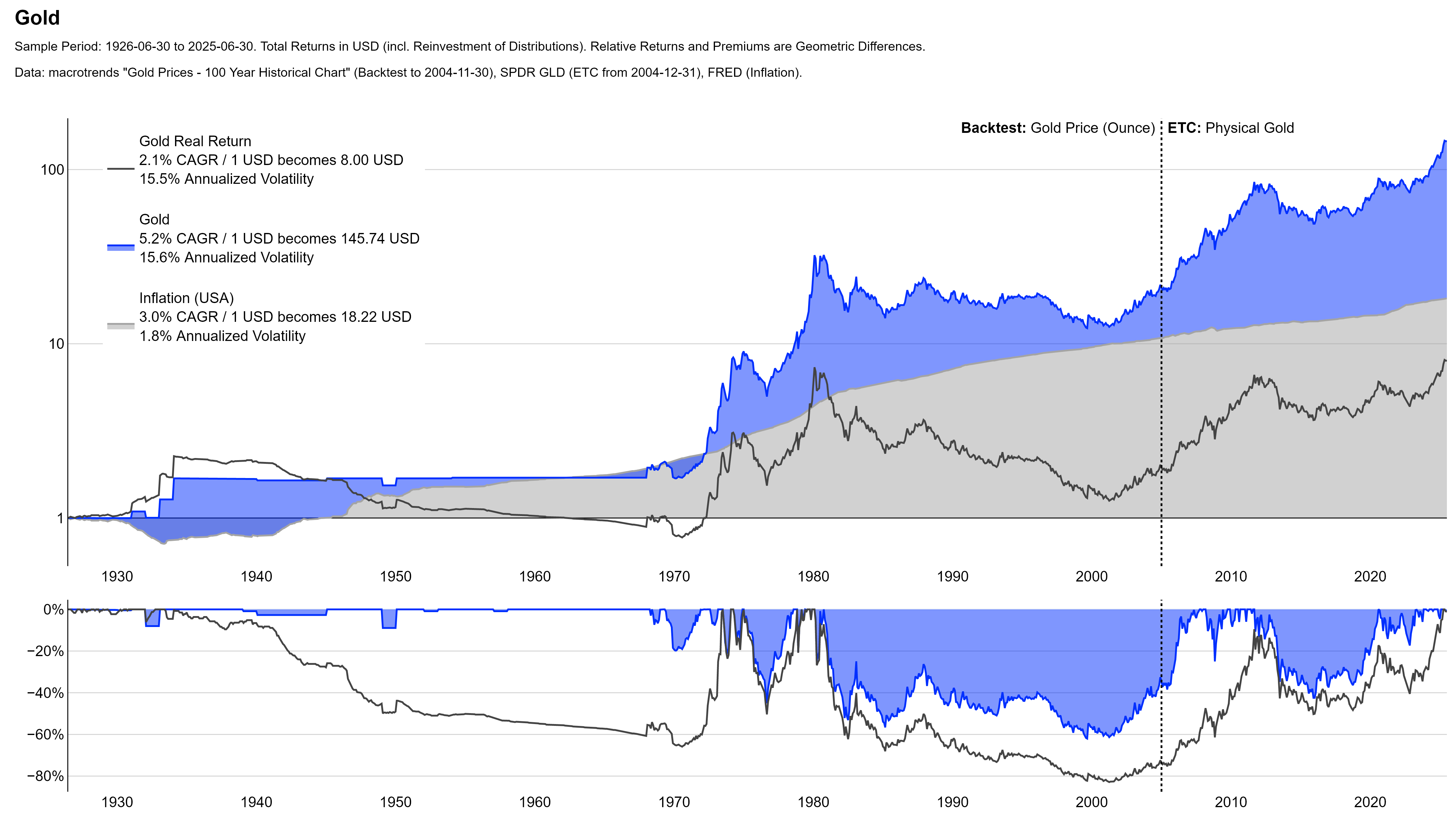
Gold
Active Investing: Some Examples
Active investing is a sensitive issue and it is important to always remember that most investors who pursue active strategies tend to end up worse than the appropriate passive benchmark.
With this in mind, the purpose of the following charts is to illustrate that it is possible to “beat the market” and add value with active investing. But it is of course easy to show great charts with the benefit of hindsight. The real challenge (and difficulty) of active investing is to do it in real-time and implement it successfully. Again, I don’t believe this is impossible. But it requires skill and most investors can probably not do it successfully over long periods of time.
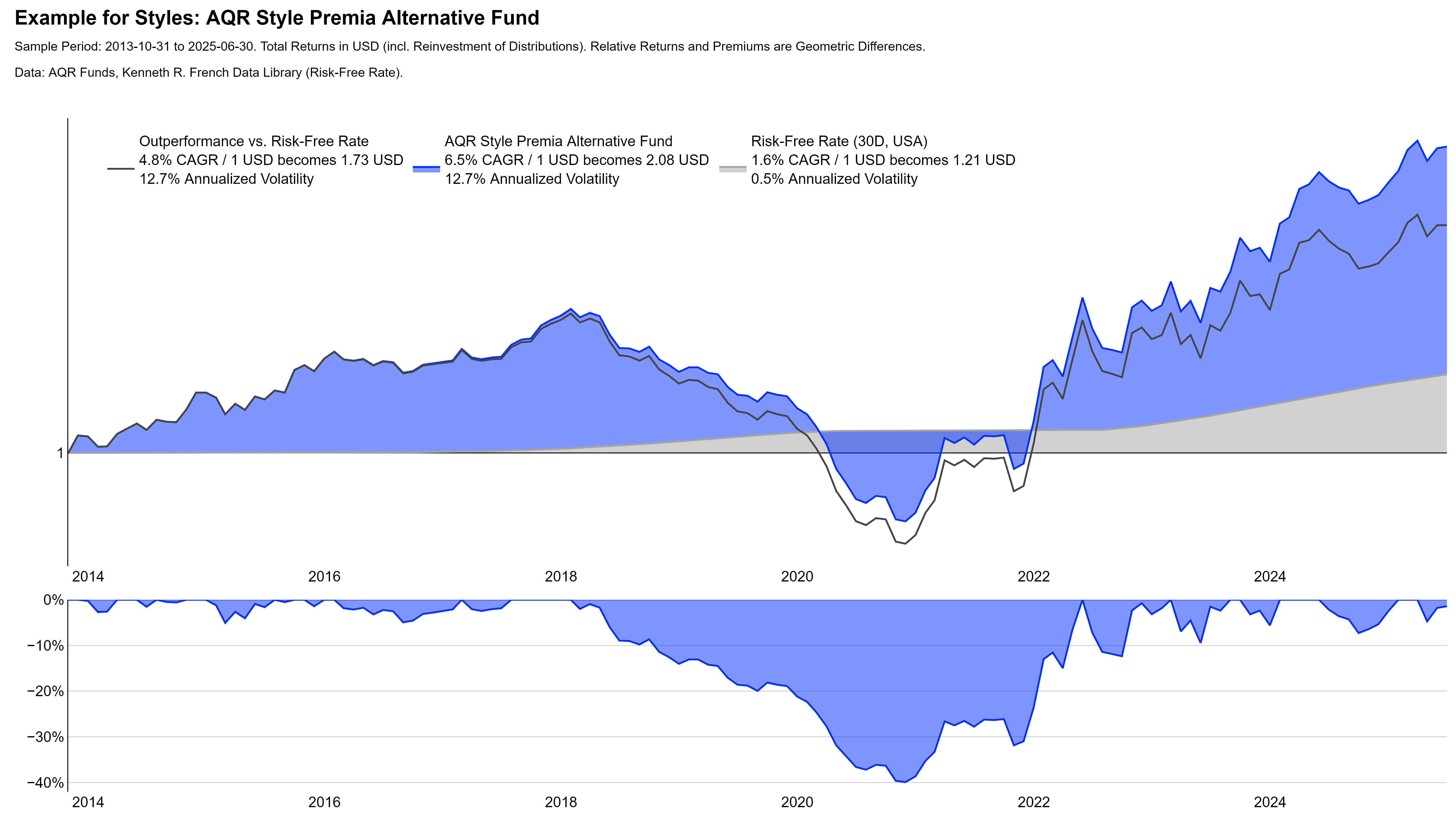
Common Styles
The AQR Style Premia Alternative Fund is one of the leading investment products in the domain of Style or Factor Investing. The specific investment process is proprietary and likely involves many details. Conceptually, however, the fund aims to harvest four major styles through long and short positions across asset classes:
Contrarian / Value:3Example reference for more details: Asness et al., 2013, “Value and Momentum Everywhere”, URL. Investments with low valuations tend to outperform those with high valuations – “Cheap beats expensive”.
Follower / Momentum:4Example reference for more details: Asness et al., 2013, “Value and Momentum Everywhere”, URL. Investments with positive short to medium-term trends tend to outperform those with negative short to medium-term returns – “Winners beat losers”.
Conservative / Defensive:5Example references for more details: Blitz and van Vliet, 2007, “The Volatility Effect”, URL; Frazzini and Pedersen, 2011, “Betting against beta”, URL; Asness et al., 2019, “Quality minus junk”, URL. Investments of lower risk and/or higher quality tend to outperform those of higher risk and/or lower quality – “Quality beats junk”.
Yield:6Example reference for more details: Koijen et al., 2018, “Carry”, URL. Investments with higher yields tend to outperform those with lower yields – “Carry trade”.
“Business” Alpha
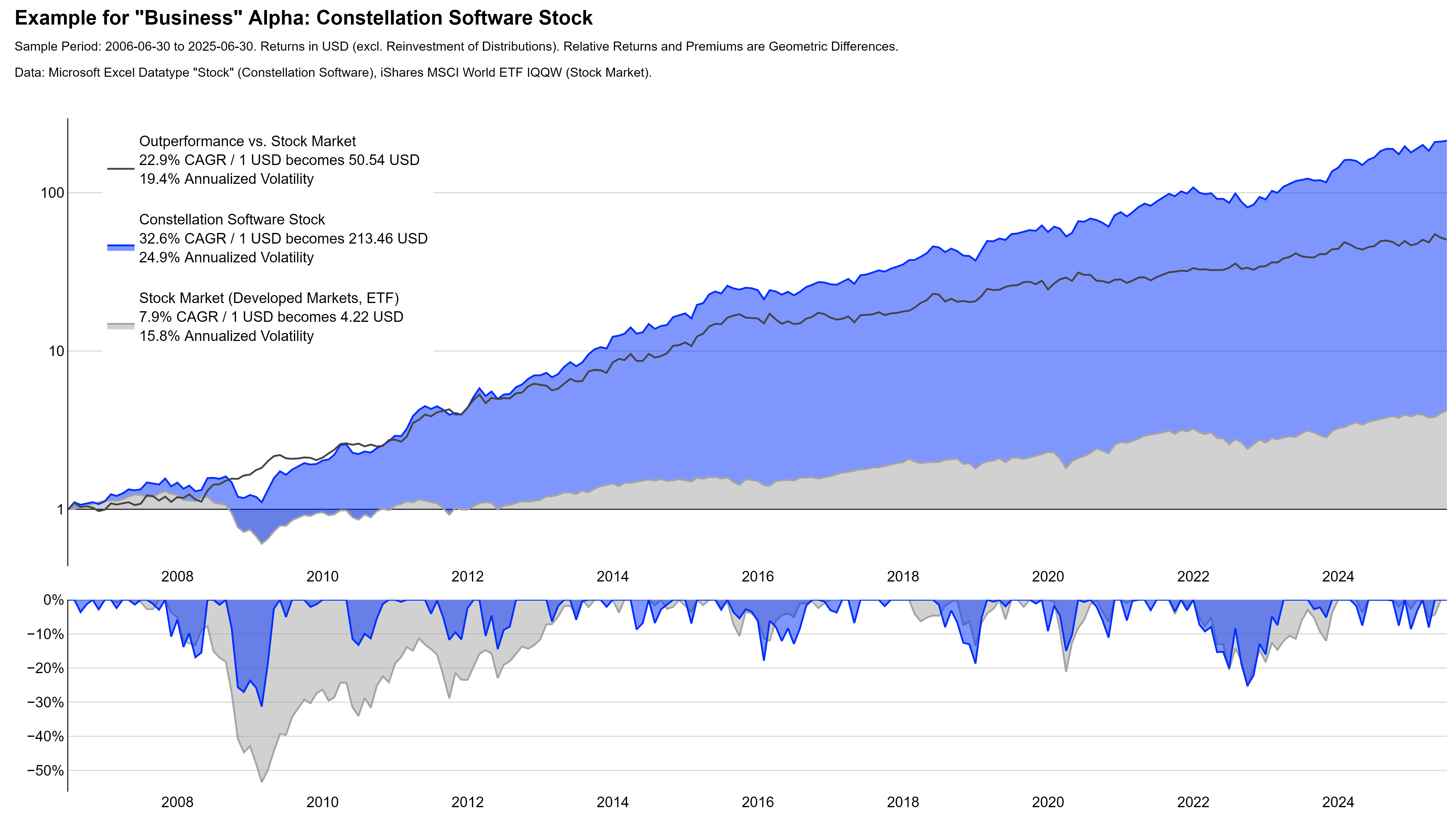
Constellation Software is a Canadian holding company that acquires, manages, and develops software companies. The company is a very extreme example for how much value an entrepreneurial and return-oriented business operation can create over time.
Of course, showing a super successful stock after the fact is easy. I accept this critique and a part of me actually feels dishonest for showing this chart. As I mentioned earlier, however, this is not a pitch for stock selection. It is an empirical example for the potential value from successful active investing with the clear disclaimer that this is not easy to do for most people.
For this purpose, I choose Constellation Software deliberately. This is not a company that created its value from a conventional business model like Apple did with smartphones or NVIDIA did with semiconductors. It is more of an investment vehicle that executed hundreds of successful acquisitions. The strong performance thus does not come from “getting one thing right” or from predicting future innovations.
In addition to that, there are now quite a few copycats of this serial-acquirer model. Some of those (not all!) also generated very attractive performance by following similar principles. This is (in my view) a further sign that entrepreneurial and business-minded investing can be a powerful strategy.
“True” Alpha
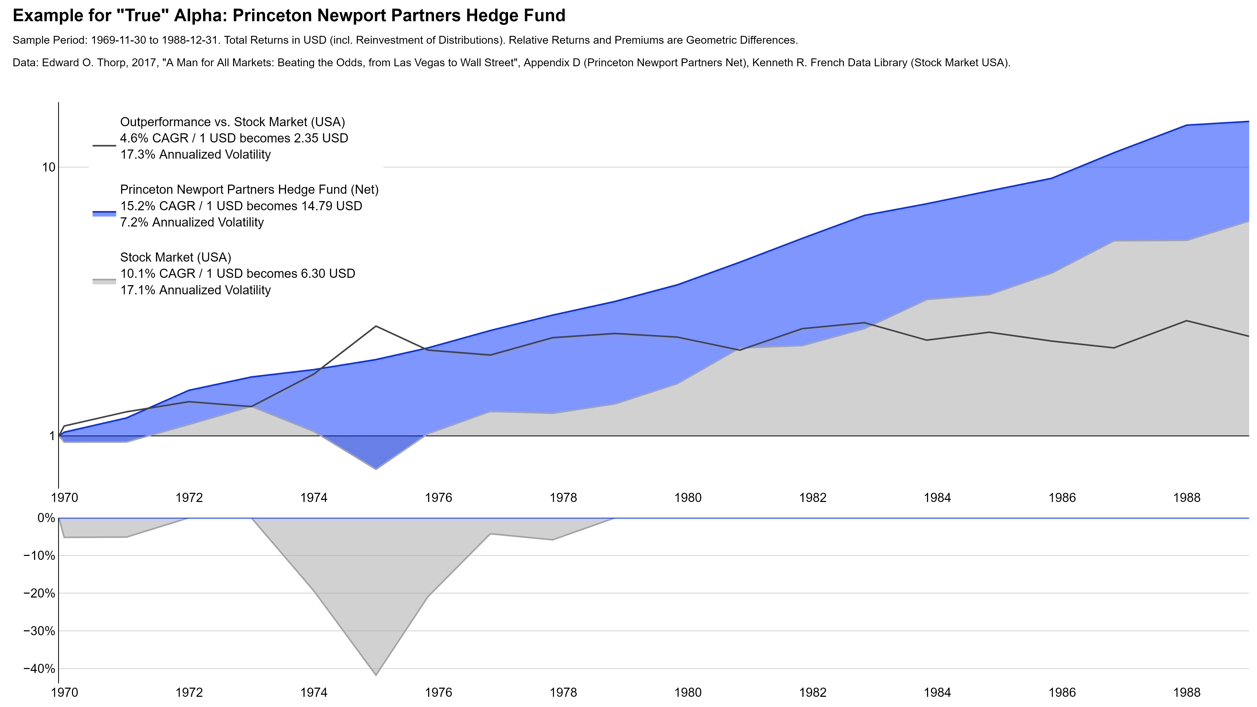
Princeton Newport Partners was the hedge fund of Edward O. Thorp, a mathematician most famous for developing card-counting in blackjack. The fund pioneered the use of quantitative analysis to profit from mispricings in derivative and equity markets. Notably, Thorp used the Black-Scholes formula to estimate the value of embedded options in warrants and convertible bonds before it became known as such. The fund outperformed the US stock market over its almost 20-year life time without a single negative year.7Because of data availability, the chart shows annual returns that hide some of the true drawdowns. According to some sources, the hedge fund had a few minor negative months. I cannot validate this.
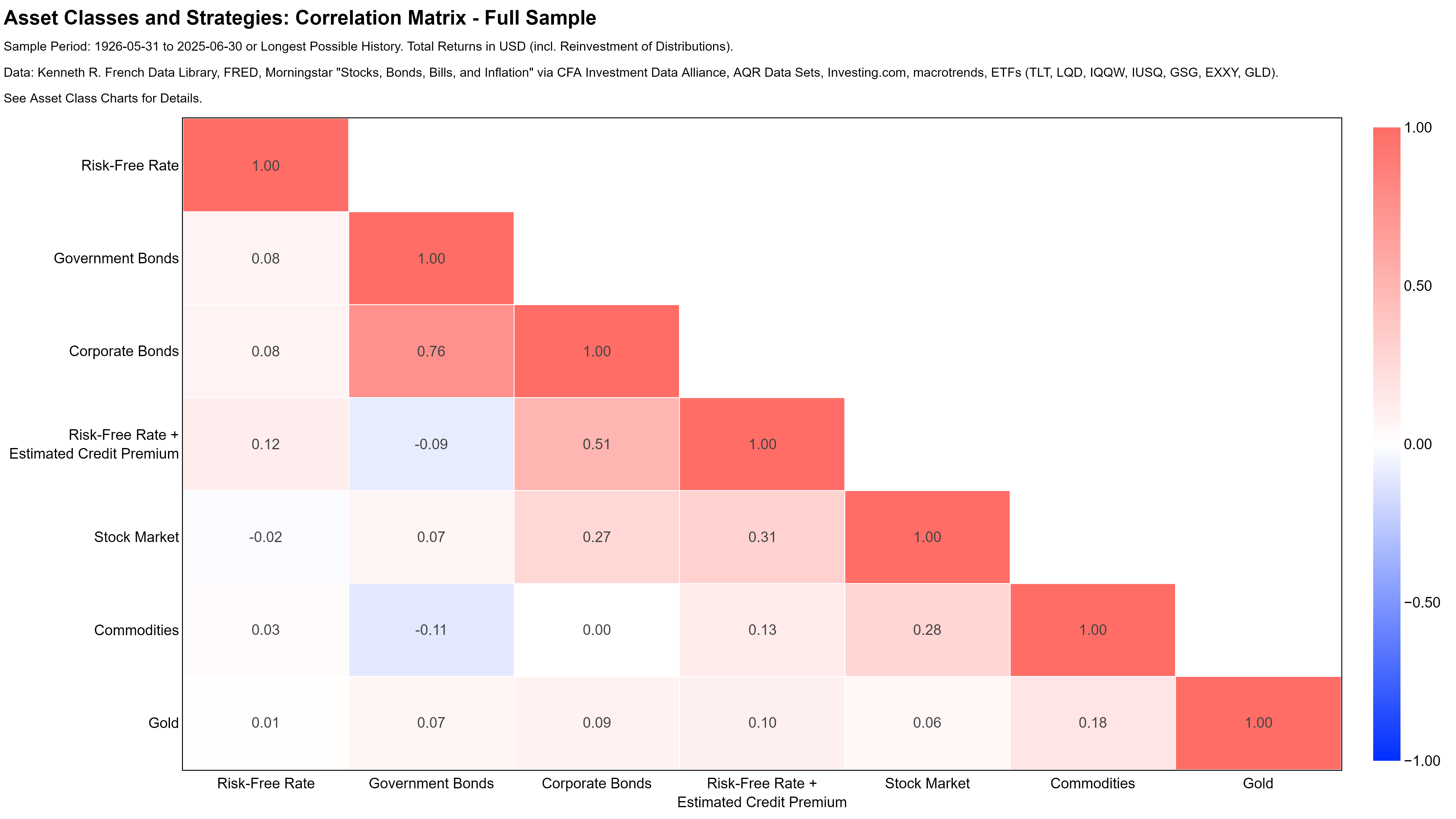
Diversification: Good and Different
Some practitioners criticize portfolio theory as being mostly useless in practice. One argument for this is the fact that expected returns and the relations of assets among each other are very difficult to estimate. This critique is valid, but in my view also not an excuse to abandon it entirely.
The core idea of portfolio theory remains straightforward and powerful. One good investment is nice, but a combination of two (or more) good investments that are good at different times is even better.
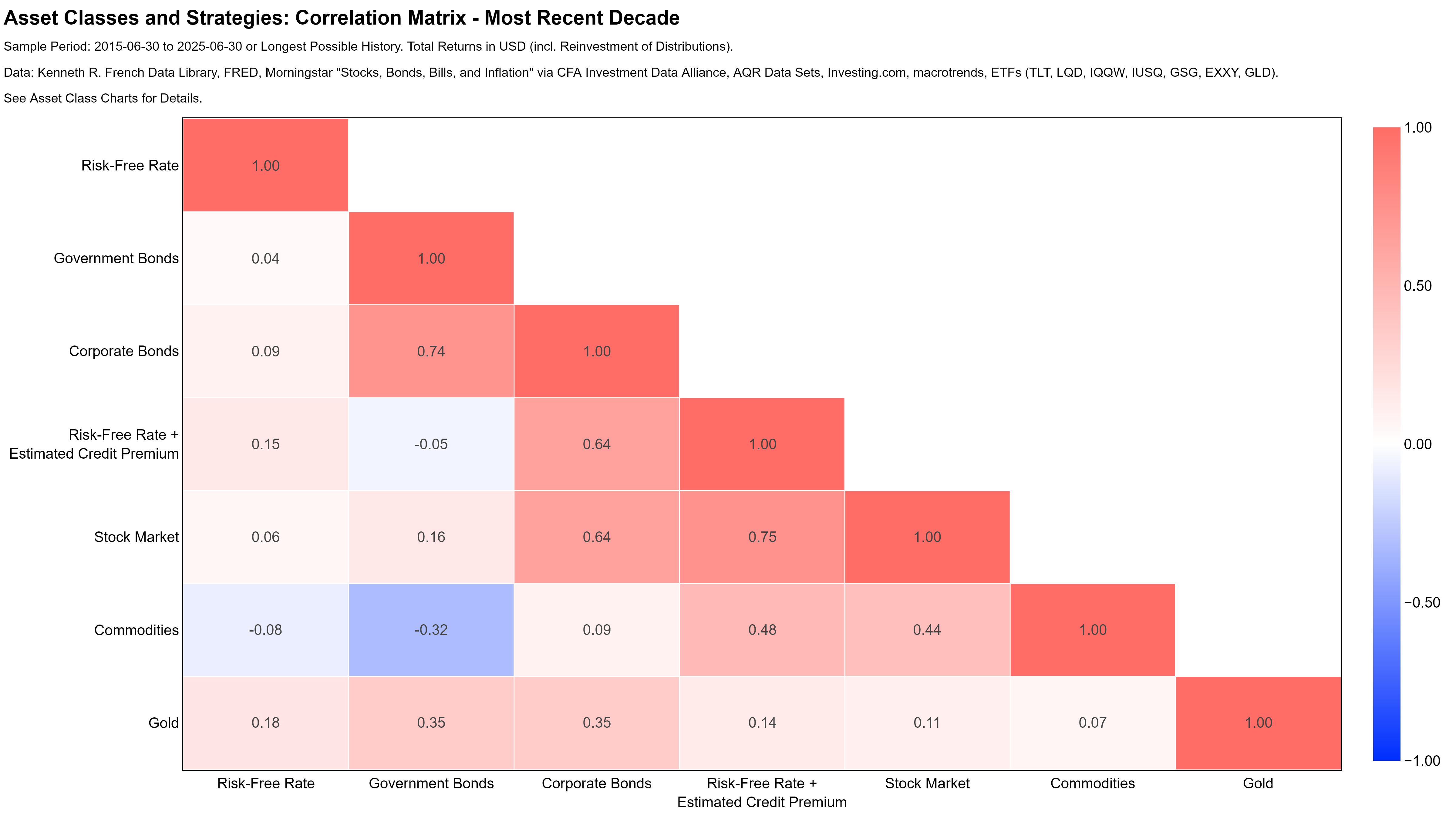
The standard way to measure “good at different times” are pairwise correlations. So before looking at portfolios, this section shows correlation matrices for the full history and the most recent decade. The second sample is purely arbitrary and illustrates that the relation between asset classes indeed changes over time.
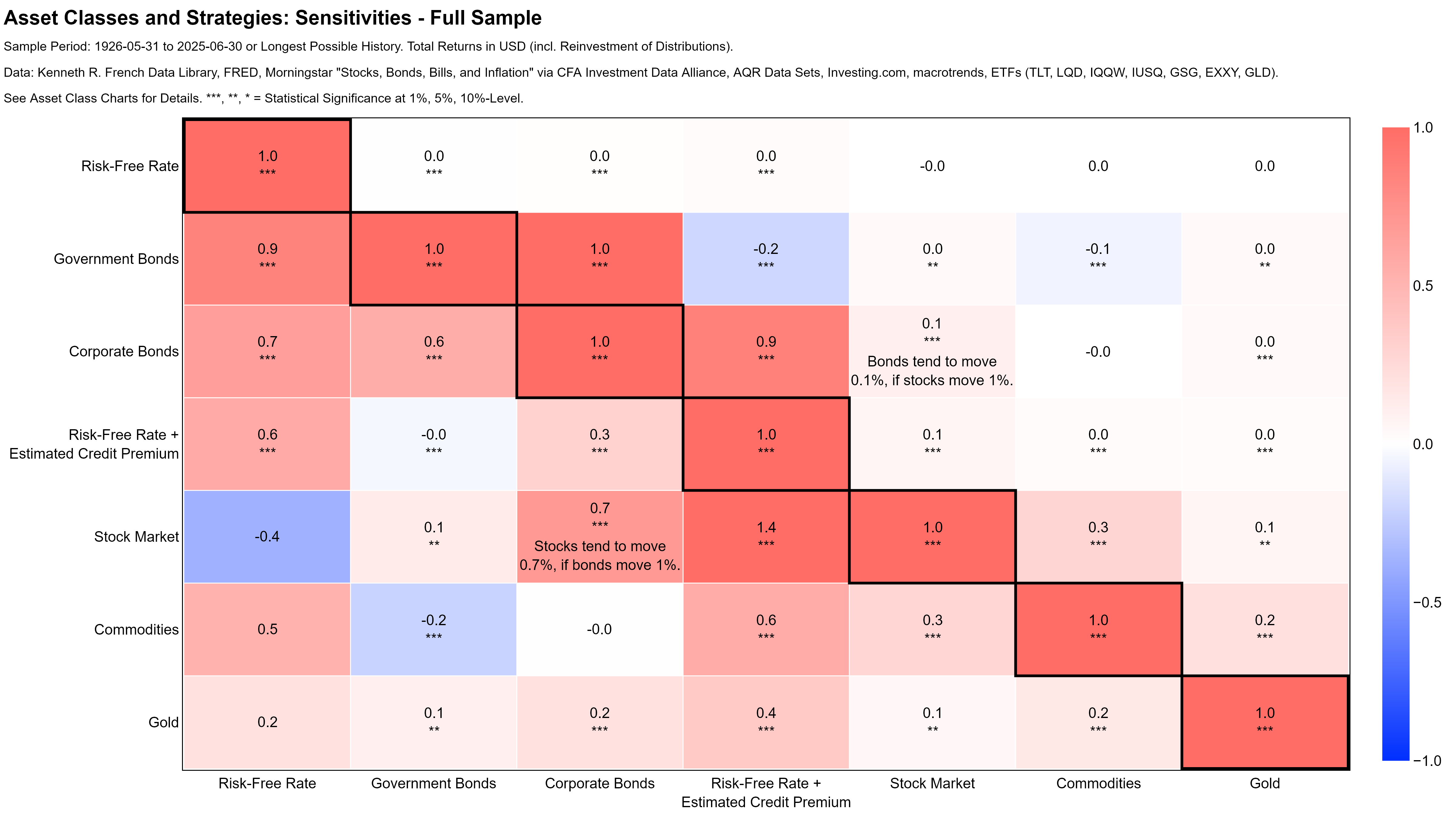
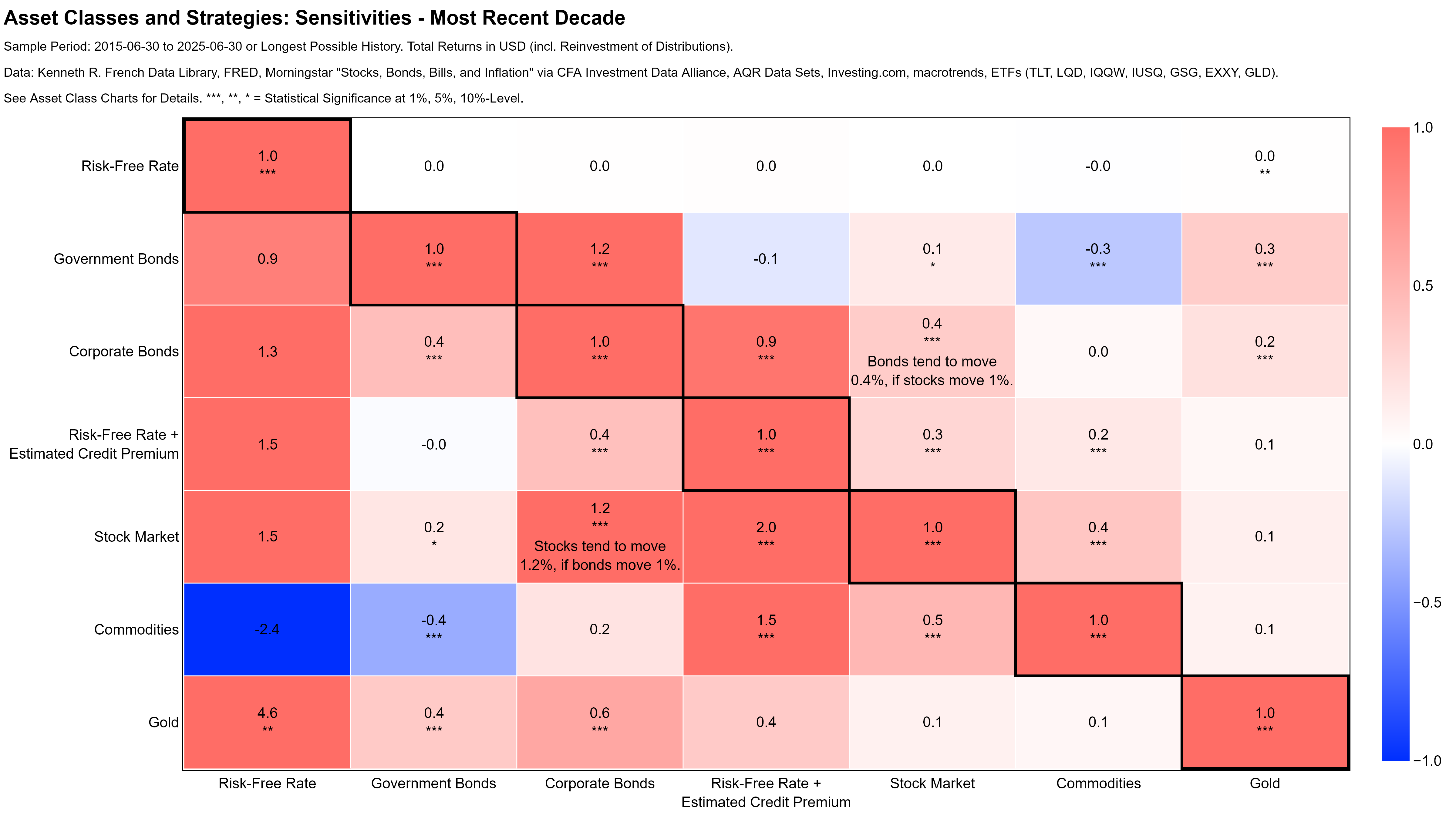
In addition, I also show a matrix of pairwise regression coefficients for (hopefully) more intuitive interpretations. As a friend from the hedge fund world once said to me, “All investors talk about correlation to stock markets, but what they actually care about is their beta to stock markets”…
Long History
Most Recent Decade
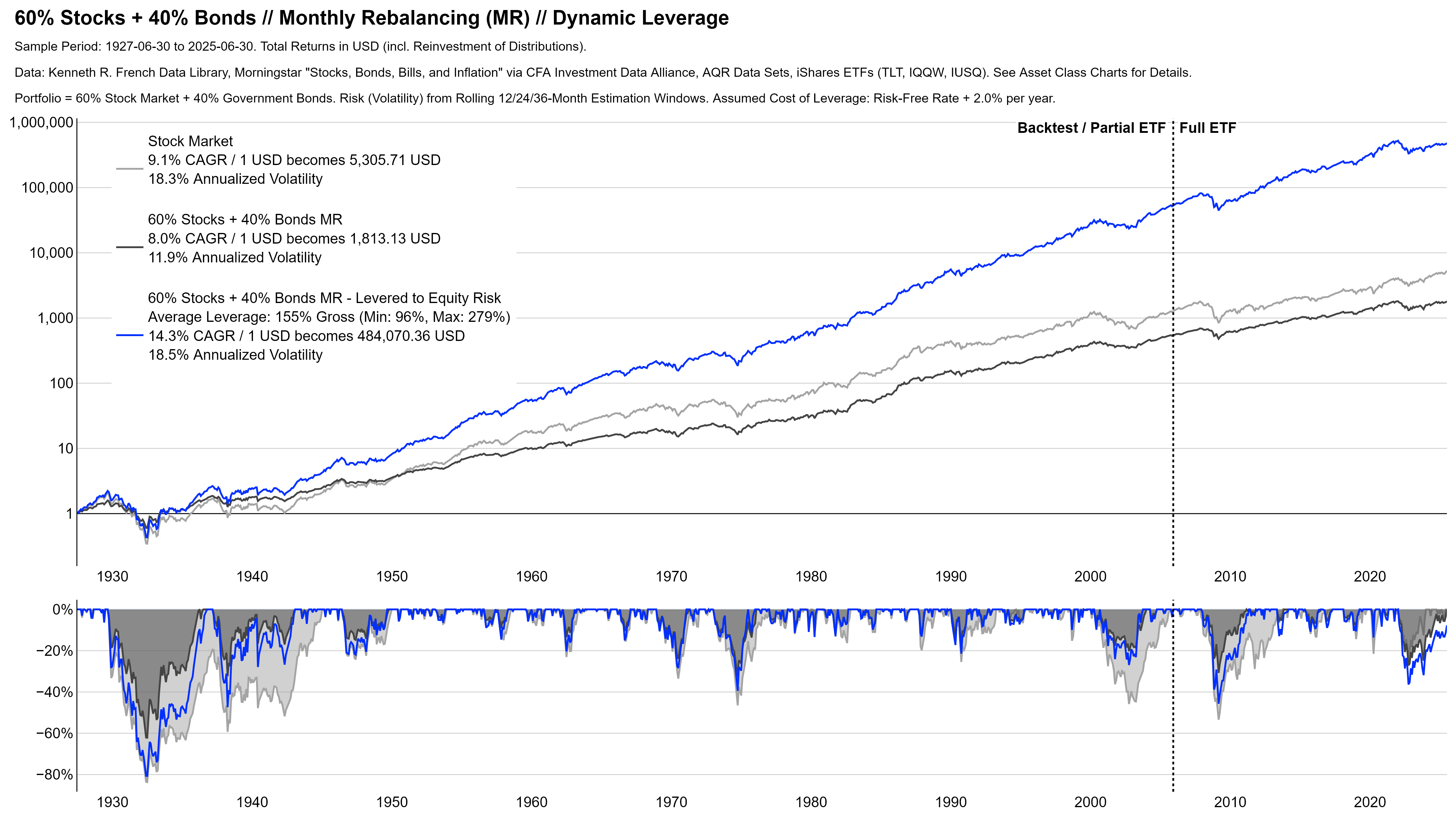
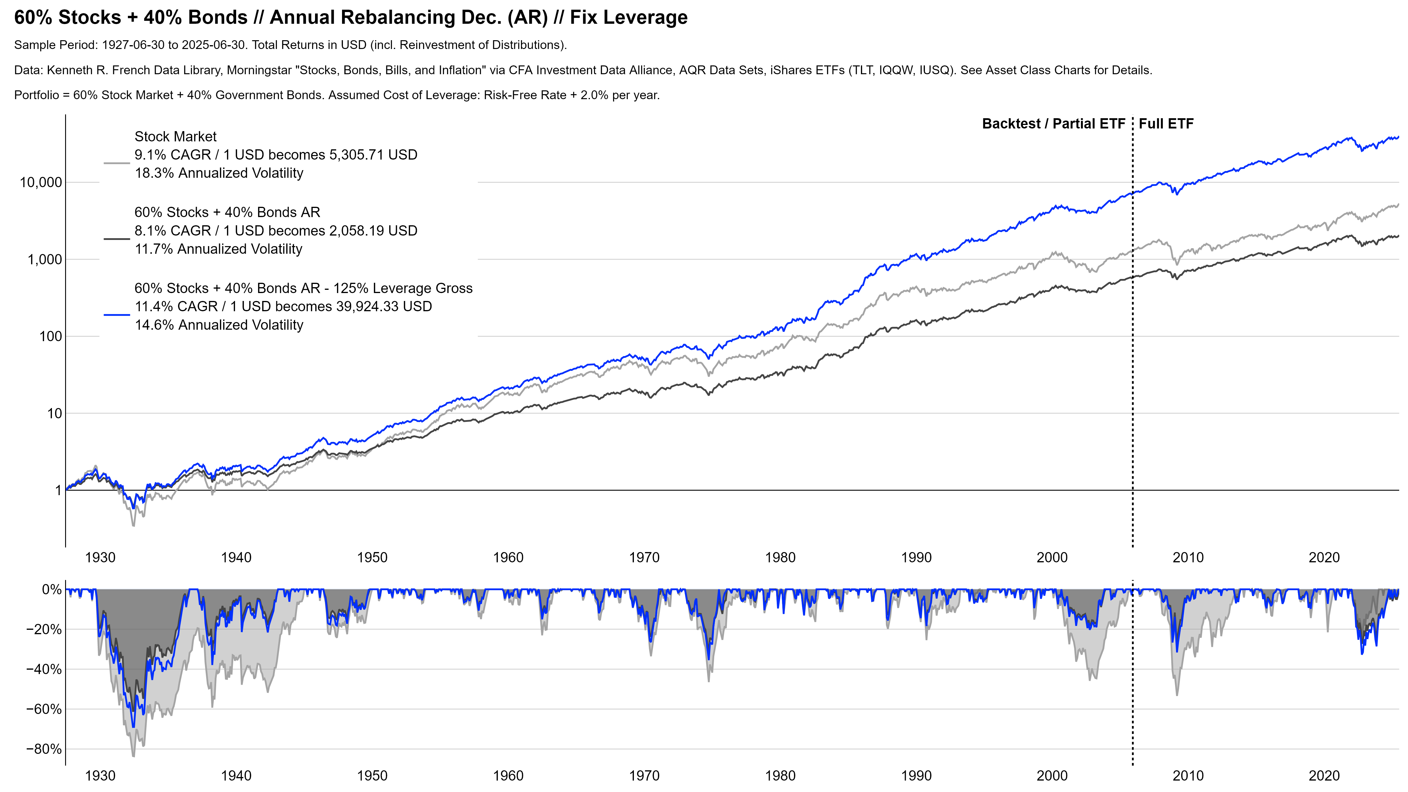
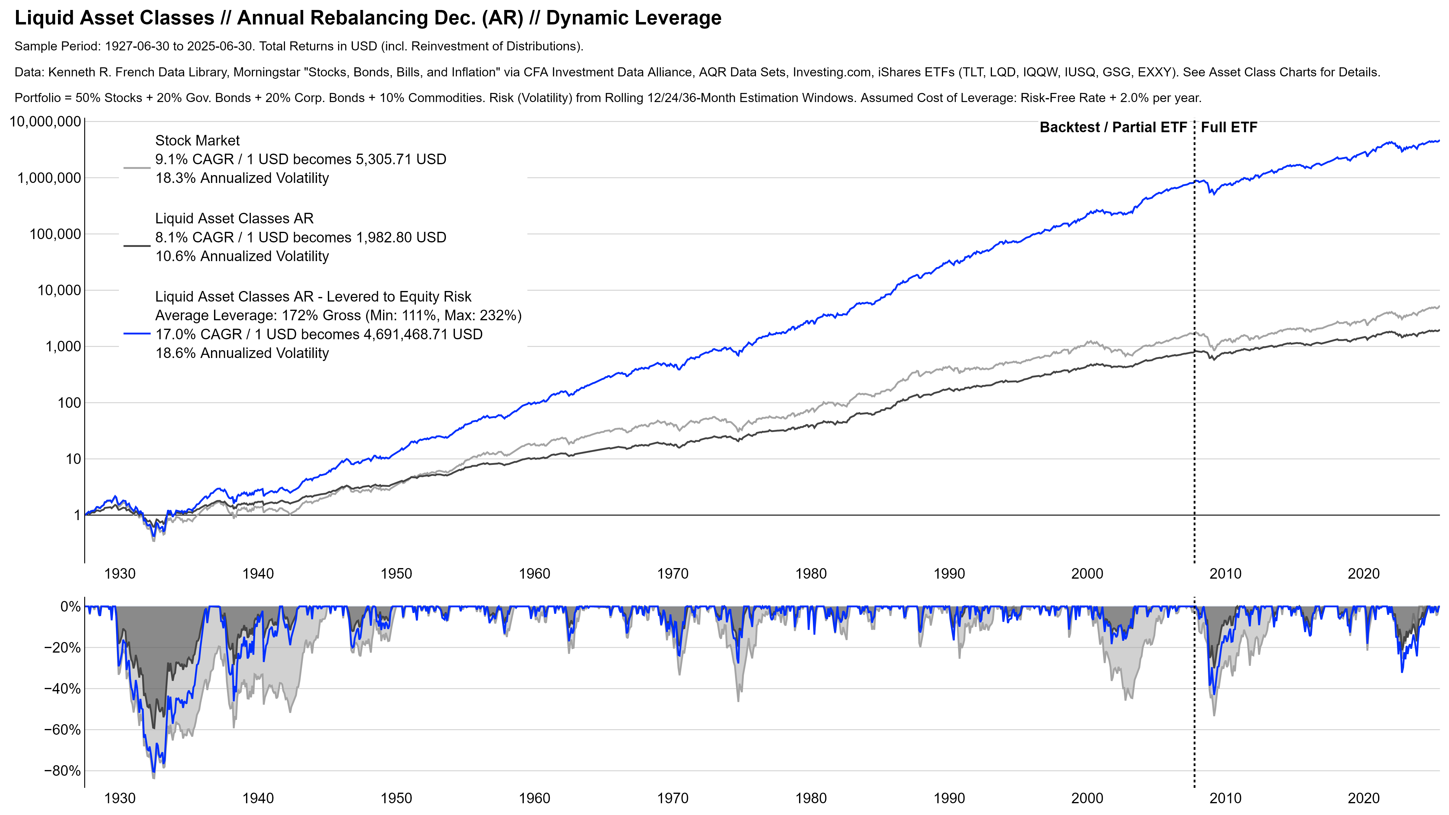
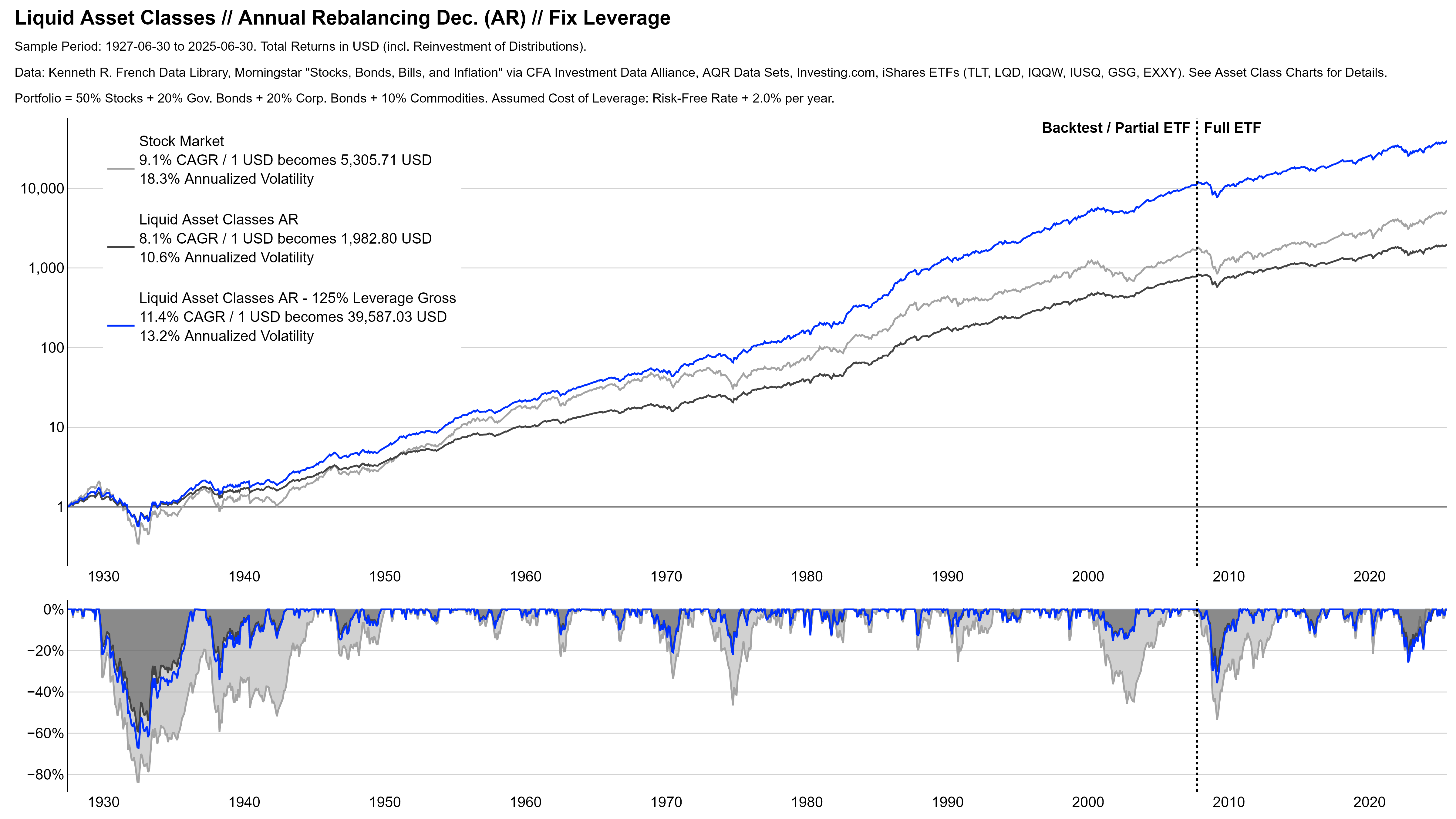
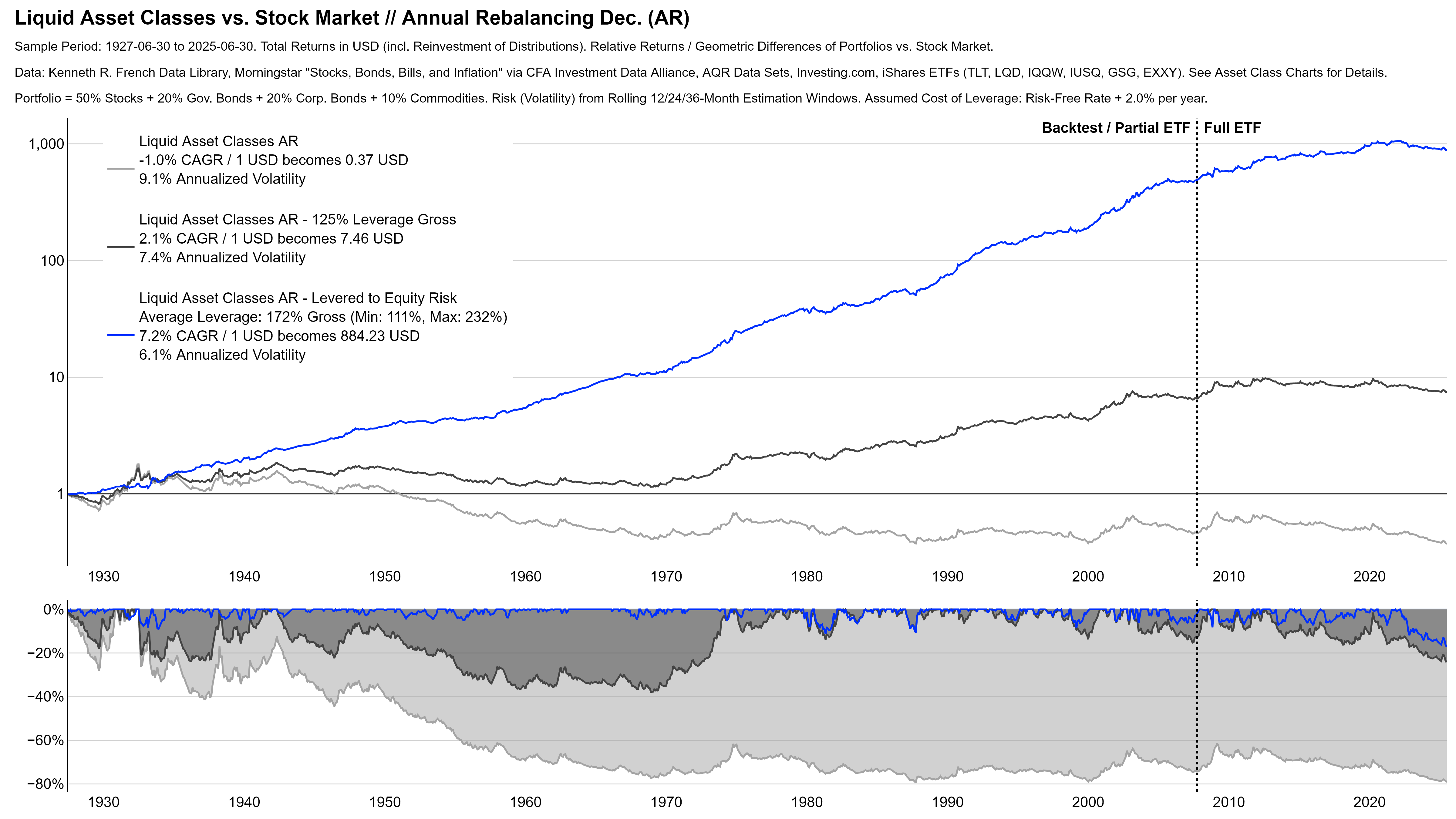
Diversification in Action: Portfolios
Introduction: Diversification, Returns, and Leverage
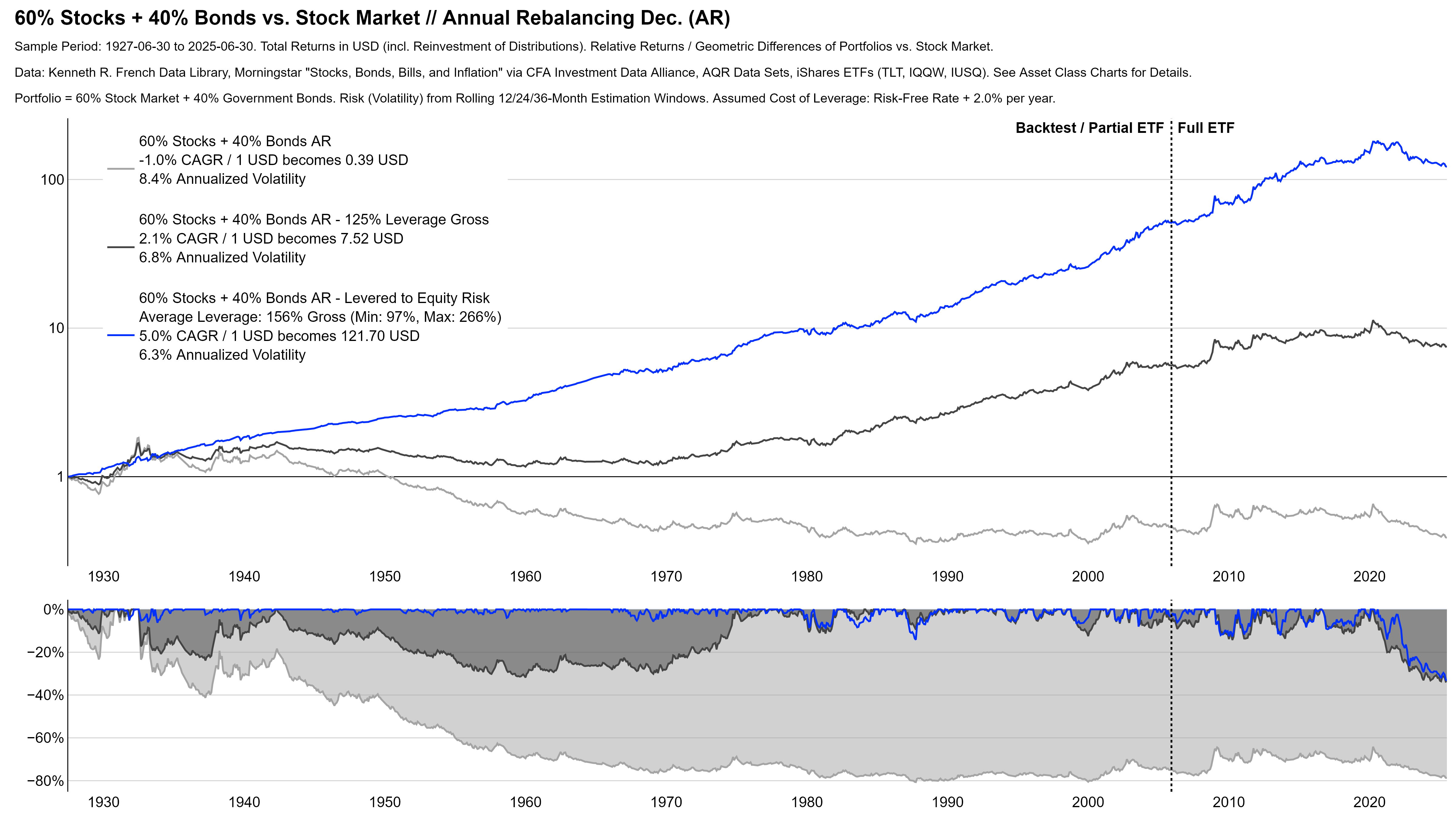
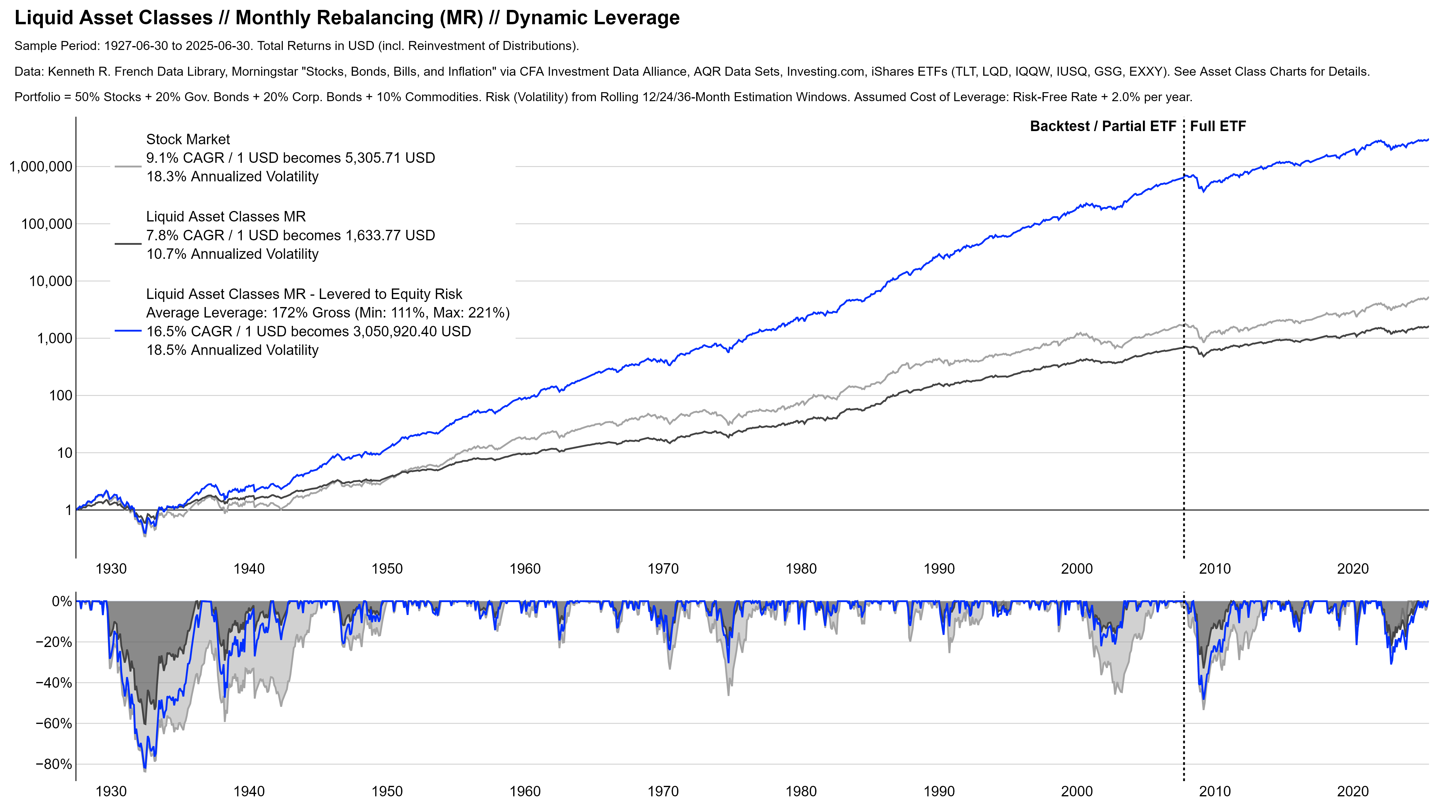
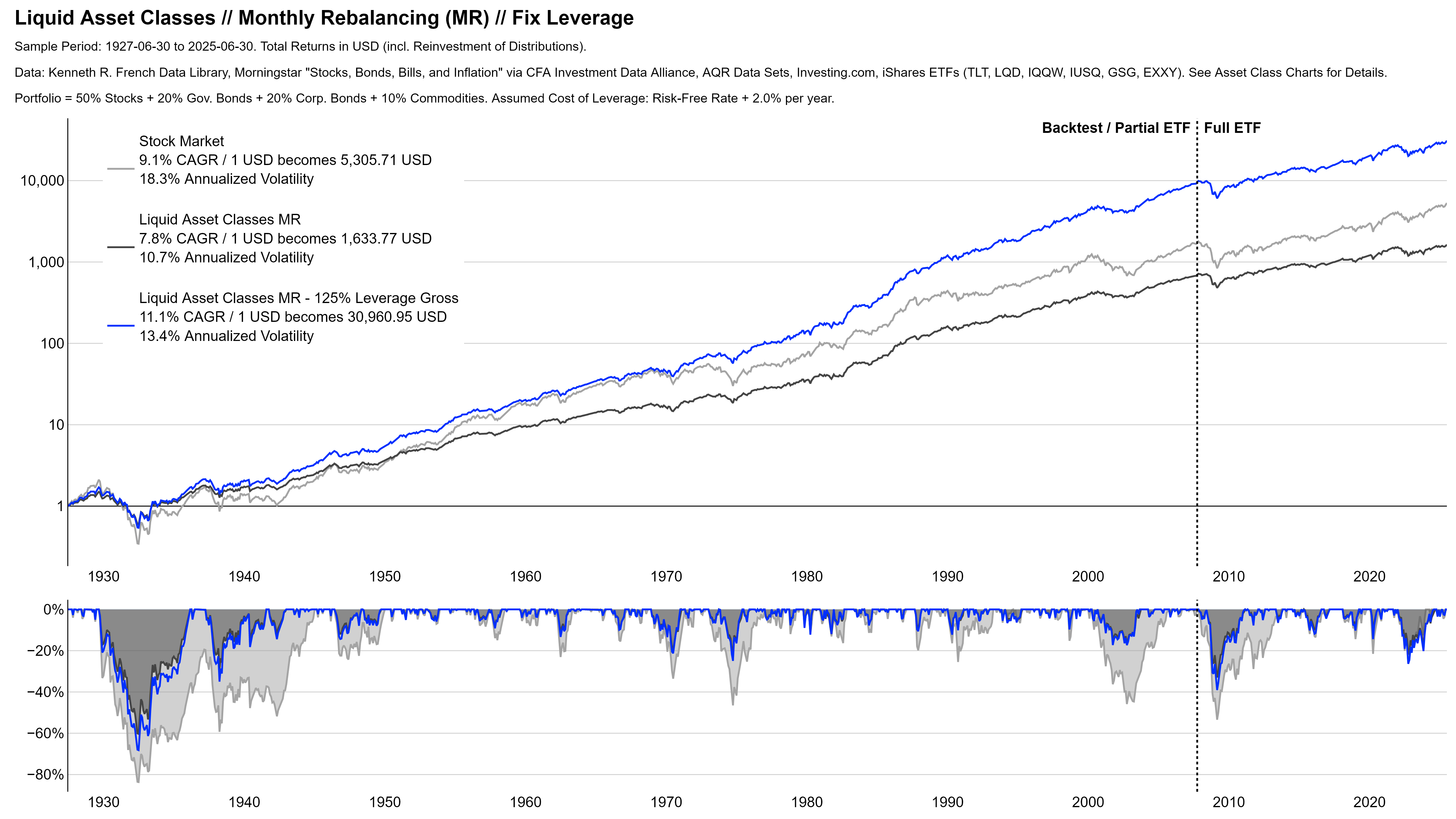
This final section illustrates the power of diversification at the example of two simple multi-asset portfolios. I want to particularly address the common misconception that diversified strategies underperform stock markets over the long-term.
Sensible investing, in my view, should always look at risk and return. It is true that almost no asset class produced the same high returns as stock markets over the long term. The key reason for that, however, is that stocks are also more risky than most other asset classes (look at the volatility and drawdowns above).
In a reasonably rational world, few people should take risks without proper compensation. So it is not surprising that the higher risk of stocks also comes with higher expected and realized returns.
If you now combine stocks with a less risky asset class like bonds, the risk of the overall portfolio usually gets lower than that of stand-alone stock markets. And once again, lower risk should come with lower expected and realized returns. No rational person should be willing to give you the high return of stocks for taking the lower risk of bonds.
So yes, a diversified investment like the famous 60/40 stock/bond portfolio comes with lower expected and realized returns than stock markets. But this is not because diversification doesn’t work, it is because this portfolio is less risky than stock markets.
In fact, both stocks and bonds have been good investments and sometimes even good at different times. Diversification therefore works as it should and improves the ratio of risk and return. Said differently, you get more return for the risk you take. Even though the absolute level of both decrease, your portfolio gets more efficient.
If this is confusing, consider the following example. Suppose you have to decide between two jobs. A full-time job that pays $100,000 per year, and a half-time job that pays $60,000 per year. Which one is better? The answer depends on what you care about. If you care about total dollars, the first one is better. If you care about the most efficient use of your time, the second one is better.
The first job represents the stand-alone stock market. You get more salary, but you work longer hours – high absolute returns from taking more risk. The second job represents the more efficient diversified portfolio. You get less salary, but this is fair since you work fewer hours. And even though you end up poorer, you spend your time more efficiently because you earn more dollars per hour. Lower absolute risk and returns, but a better ratio of risk and return.
Now, wouldn’t it be great to combine two such $60,000 half-time jobs into a $120,000 full-time job? That would tick both boxes. More dollars per hour and more dollars in total. The good news is: this is possible in investing. By using leverage, we can adjust the risk – and with that the expected return – to the absolute level we want.8Subject to practical limitations on leverage, of course.
The core idea is again straightforward. Suppose stock markets are twice as risky as the diversified portfolio. How do you then get the same return from the diversified portfolio? You invest twice the money. If you start with $1,000 of your own funds, you borrow another $1,000 and invest a total of $2,000. This is called a leverage of 200% gross, because you invest 200% of your own funds. At the end of the investment horizon, you repay the $1,000 plus interest and keep the returns you earned on them as additional profits.
This “levers” the return on your own funds. Importantly, however, this works in in both directions. If your diversified portfolio is successful, you will make twice the money. But if it is not, you will also lose twice the money.
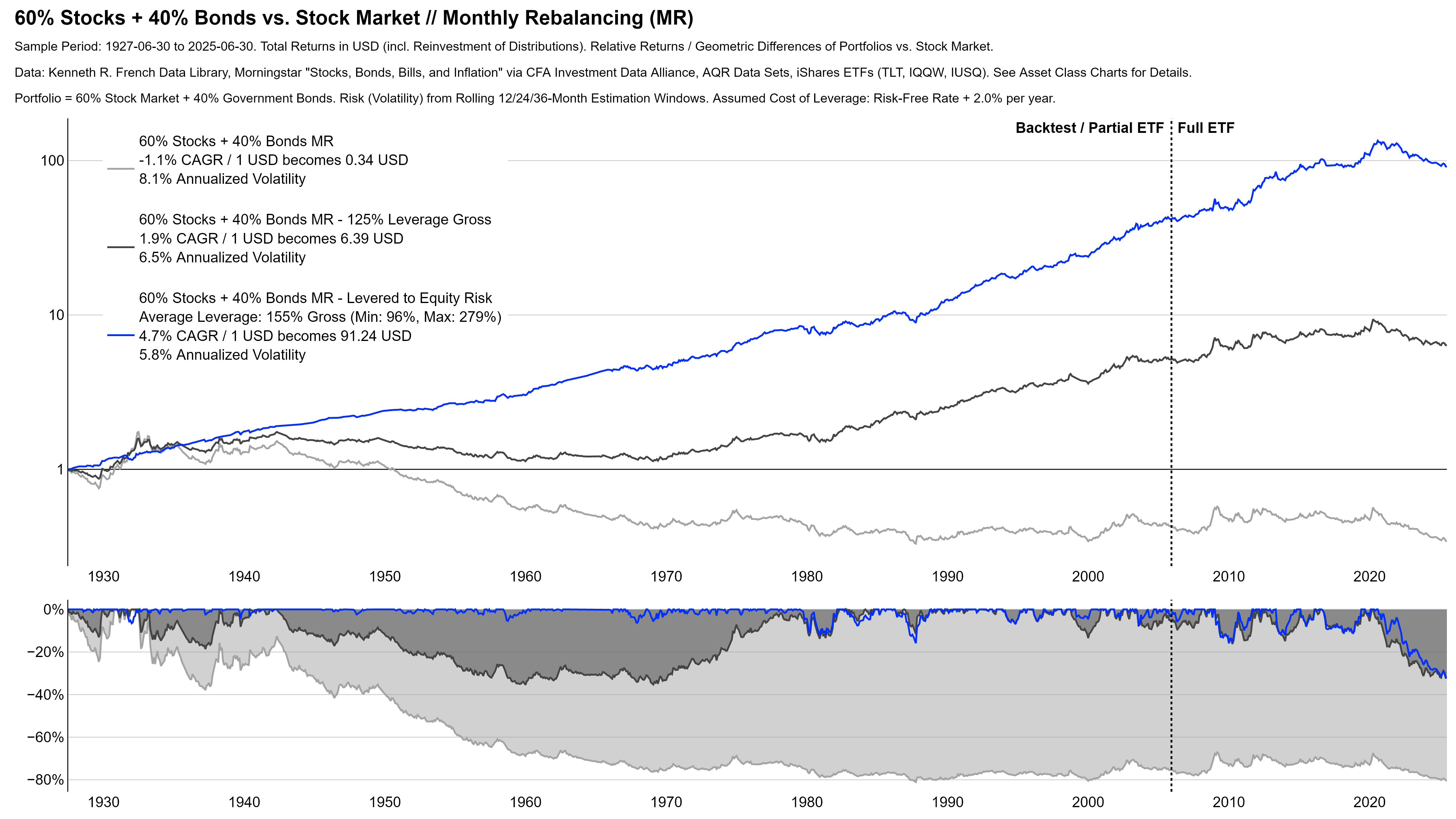
Once you use this tool and re-lever diversified multi-asset portfolios to roughly the same risk-level like stock markets, the misconception disappears (see charts below). The levered diversified portfolios typically outperform stock markets considerably and maintain a better ratio of risk and return. That is the power of diversification.
Finally, I want to offer some understanding for those who complain about multi-asset portfolios’ underperformance versus stock markets. Many investors understandably care more about their absolute return than their ratio of risk and return. In theory, we could just tell them the above. If you need more return, just lever up.
In practice, however, many investors cannot or want not do this. Retail investors do not have access to cheap-enough leverage, institutions cannot borrow for regulatory reasons, some people simply don’t want to have debt for their peace of mind, leverage is a different type of risk that can go fatally wrong when poorly managed, and the list goes on.
For such investors, not diversifying and sticking with stock markets that provide the desired absolute return can be the optimal strategy. But this is not because diversification does not work. It is because they have individual constraints that do not allow them to unlock the full value of diversification. If you have expenses of $80,000 and cannot double the $60,000 half-time job to a $120,000 full-time job, you have to take the $100,000 full-time job. Even though it pays less per hour and is not the most efficient use of your time.
Remarks on Methodology
Before we finally get started with the portfolio charts, a few points to the methodology. I use the asset class time series from above, so the previous explanations remain valid. Importantly, all of the portfolios reflect real-world fund performance whenever possible. For each portfolio, I calculate four versions and try to make them as robust as possible.
Rebalancing: The “Fast” rebalancing version rebalances at the end of every month. This is probably unrealistic and too costly in practice, especially for the longer history. The “Slow” rebalancing version mitigates this and rebalances only once a year at the end of December.
Leverage: I estimate the risk of portfolios and the stock market from an average of rolling volatilities over multiple windows. The ratio of those volatility estimates determines the portfolio leverage.9If the stock market is 1.5x as risky as the portfolio, the diversified portfolio needs a gross exposure of 150%. That means the investor borrows $0.50 for every dollar of her own funds. The “Dynamic Leverage” version adjusts the leverage every month. This is probably again unrealistic and too costly in practice, especially for the longer history. The “Fix Leverage” version mitigates this and assumes a rather modest gross leverage of 125% without adjustments.
Borrowing Cost: I assume annualized borrowing costs of 200 basis points over the monthly risk-free rate. For the longer backtest, this may be too optimistic. For the more recent history and going forward, I consider this rather conservative. For example, it is nowadays possible to effectively borrow at almost the risk-free rate via futures.
Biases: I make efforts to prevent data mining and other biases wherever possible. For example, I include one-month time lags for the volatility estimates to prevent look-ahead bias. A remaining weakness is the fact that the portfolios hypothetically trade at month-end closing prices and do not include transactions costs. You almost certainly won’t get those prices in practice.
Further Ideas: Most of this is rather simple and today’s investment world is (at least partly) more sophisticated. We could of course extend this analysis to risk parity, constrained optimization, regime switching models, and so on. For the big picture, however, I want to keep it simple and hopefully understandable.
One final comment to give you the honest and full story. I do believe that diversification and leverage are powerful tools that can unlock a lot of value when used correctly. But they are by no means a guaranteed path to success. For each portfolio-version, I therefore also show the relative returns vs. stock markets over time. The big picture looks attractive, but there clearly are long periods of underperformance versus plain and simple stock markets. In particular for the slower rebalancing and fix leverage versions.
60/40 Portfolio
Theory: “Fast” Rebalancing
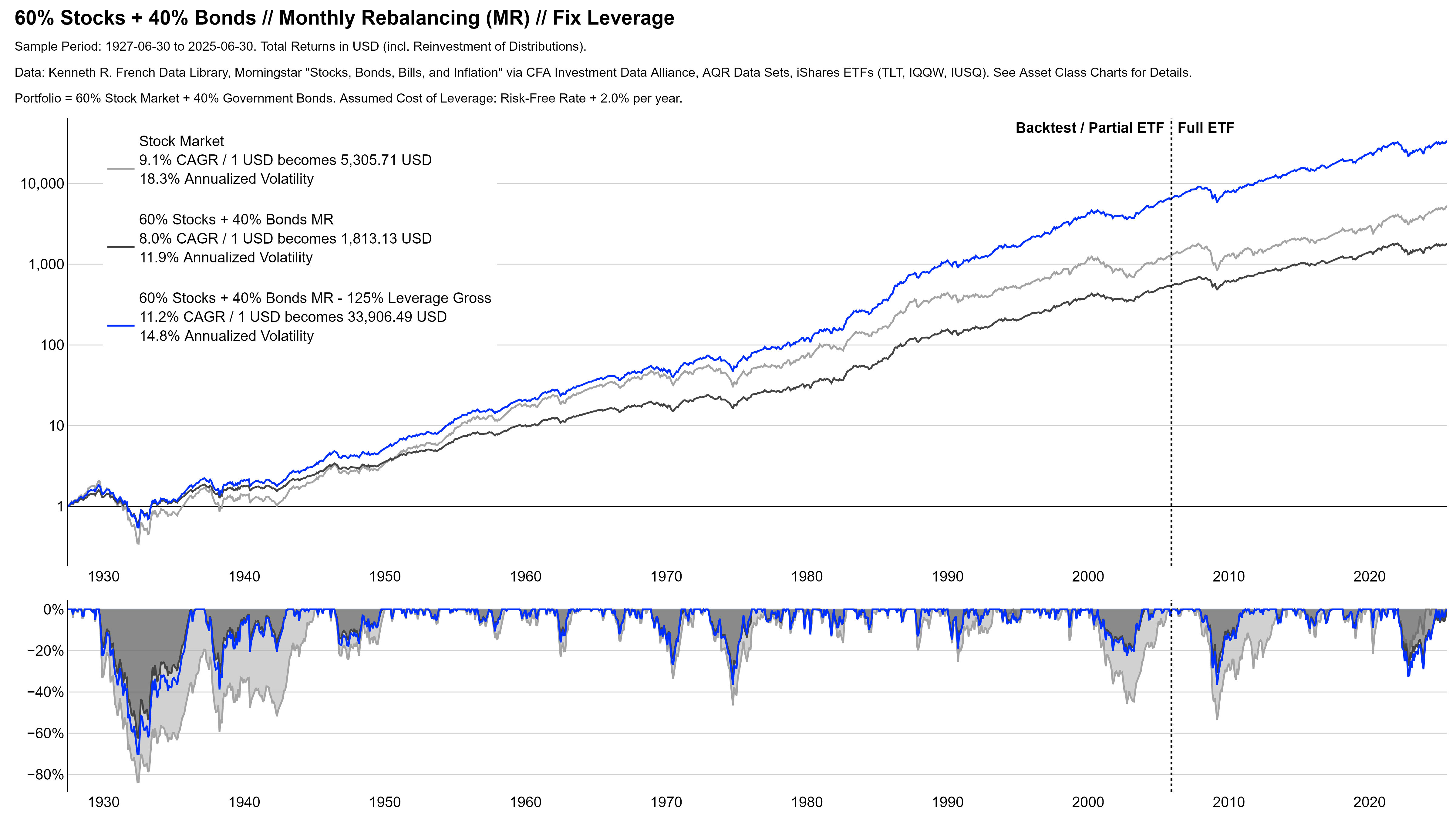
Practice: “Slow” Rebalancing

Multi-Asset Portfolio
Theory: “Fast” Rebalancing
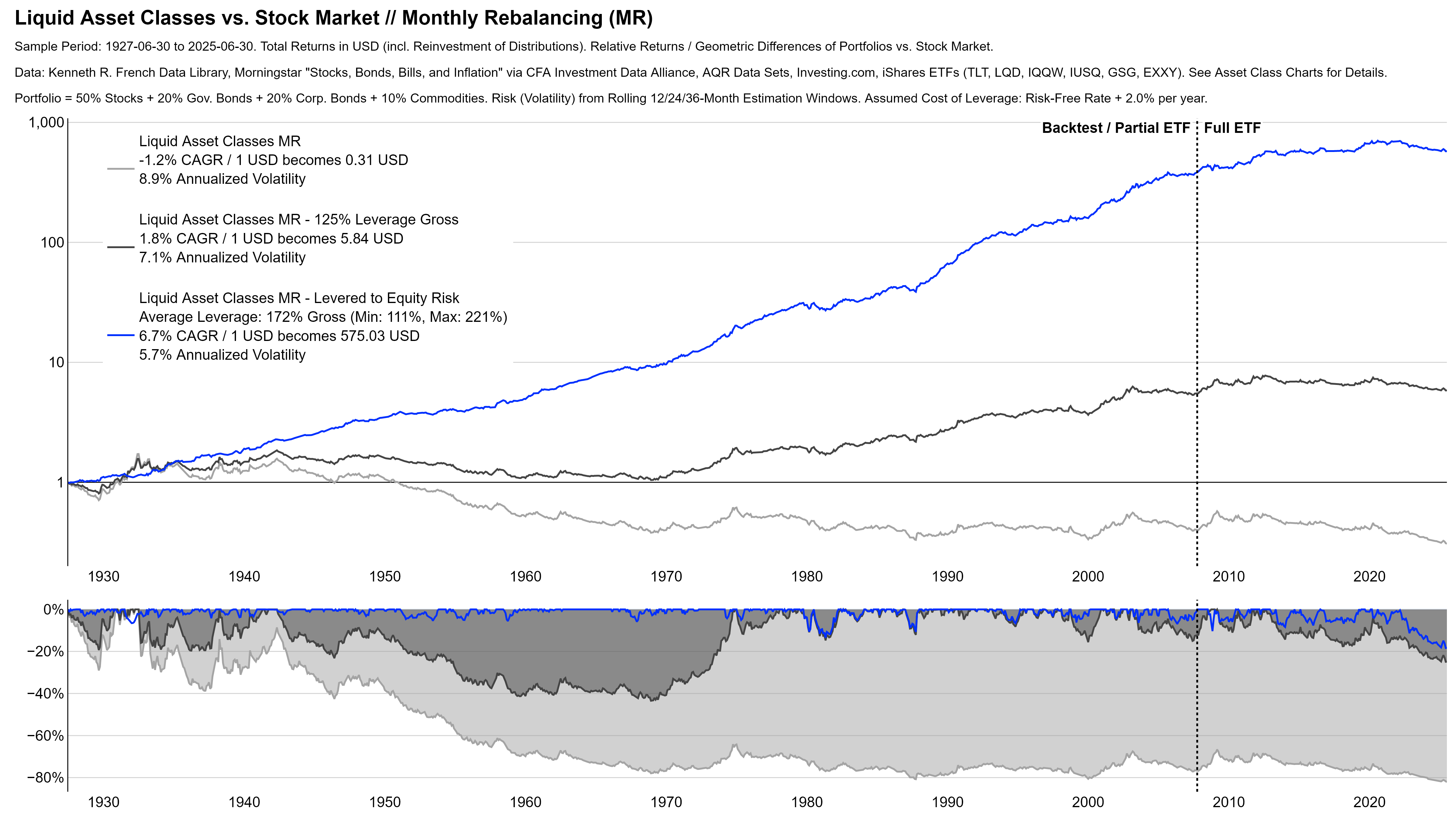
Practice: “Slow” Rebalancing
Conclusion and Next Steps
First of all, congratulations and thank you to everyone who made it through 26 charts to this final section. As I mentioned in the beginning, this post is just a preview of a more comprehensive philosophy-document. After 26 charts this might be hard to believe, but this document will cover even more and provides a few ideas how to use this evidence for actual portfolios.
However, I want to conclude this post with one broader idea. Good and successful investing doesn’t have to be complicated. In my view, every investment option out there is just some combination of the elements in the pyramid. Choosing the ones you believe in, and implementing them with discipline and rigor is really all that it takes. But as Warren Buffett10Quoted from the Morning Session of the 2009 Berkshire Hathaway Annual Meeting (URL). once said, this is “[…] simple, but not easy.”.
Antti Ilmanen11Quoted from Antti Ilmanen, 2022, “Investing Amid Low Expected Returns: Making the Most When Markets Offer the Least”, Page 12, URL., whose work had a large (and I believe positive) impact on me, even goes a step further and claims that “If good investing were easy, fun, and exciting, its fruits might really get “arbitraged away.”. I guess this a finance PhD’s version of an inspiring motivation to keep going, but I think he is absolutely right…
- #6: The (Agnostic) Big Picture of Investing
- #5: Working for 4 Years
- #4: Warren Buffett is not an Index Hugger
- How to Use This Site
This content is for educational and informational purposes only and no substitute for professional or financial advice. The use of any information on this website is solely on your own risk and I do not take responsibility or liability for any damages that may occur. The views expressed on this website are solely my own and do not necessarily reflect the views of any organisation I am associated with. Income- or benefit-generating links are marked with a star (*). All content that is not my intellectual property is marked as such. If you own the intellectual property displayed on this website and do not agree with my use of it, please send me an e-mail and I will remedy the situation immediately. Please also read the Disclaimer.
Endnotes
| 1 | “Self-imposed deadline” is somewhat of a contraction in itself, isn’t it? |
|---|---|
| 2 | However, it is true that certain underlying assets only trade in private markets, and some only trade in public markets. |
| 3, 4 | Example reference for more details: Asness et al., 2013, “Value and Momentum Everywhere”, URL. |
| 5 | Example references for more details: Blitz and van Vliet, 2007, “The Volatility Effect”, URL; Frazzini and Pedersen, 2011, “Betting against beta”, URL; Asness et al., 2019, “Quality minus junk”, URL. |
| 6 | Example reference for more details: Koijen et al., 2018, “Carry”, URL. |
| 7 | Because of data availability, the chart shows annual returns that hide some of the true drawdowns. According to some sources, the hedge fund had a few minor negative months. I cannot validate this. |
| 8 | Subject to practical limitations on leverage, of course. |
| 9 | If the stock market is 1.5x as risky as the portfolio, the diversified portfolio needs a gross exposure of 150%. That means the investor borrows $0.50 for every dollar of her own funds. |
| 10 | Quoted from the Morning Session of the 2009 Berkshire Hathaway Annual Meeting (URL). |
| 11 | Quoted from Antti Ilmanen, 2022, “Investing Amid Low Expected Returns: Making the Most When Markets Offer the Least”, Page 12, URL. |